

Most CRO checklists hand you 25 items and leave you staring at the screen wondering where to start. That is the real problem. Not your website. Not your traffic. The checklist itself.
Here is the thing: fixing your conversion rate is not about doing everything at once. It is about fixing the right thing first. This checklist is organized by where visitors are in your funnel, so you work through it in the right order.
The average website converts between 2 and 4 percent of its visitors. Strong performers hit 5 to 10 percent. The gap between those two numbers usually comes down to a handful of fixable problems. This guide will help you find yours.
Pick one goal per page before you touch anything.
Trying to get visitors to sign up, buy, watch a video, and follow you on social media from the same page does not work. Each extra goal splits attention and drops conversions. Choose one desired action per page and build everything around that.
Set up tracking before you make a single change.
If you cannot measure the before, you will never know if your fix worked. At minimum, connect Google Analytics 4 and define one measurable goal per page. Free tools like Microsoft Clarity take about five minutes to install and start showing you session recordings immediately.
A conversion is any action you want a visitor to take. That includes a purchase, a form submission, a demo request, a newsletter sign-up, a phone call, or a free trial start. The action depends on your business. What matters is that you define it before you start testing anything.
Fix these first. Everything else you do sits on top of this foundation. A fast, working website that loads correctly on a phone is table stakes in 2026. If this is broken, nothing else matters.
53 percent of mobile users abandon a page that takes more than 3 seconds to load. That is a Google-sourced stat, and it has held up across years of research. Slow pages bleed conversions before visitors read a single word.
Run your URL through Google PageSpeed Insights right now. It is free and takes 30 seconds. Look at your Largest Contentful Paint score first. That is the metric most directly tied to user experience and bounce rate.
Three quick fixes that help immediately:
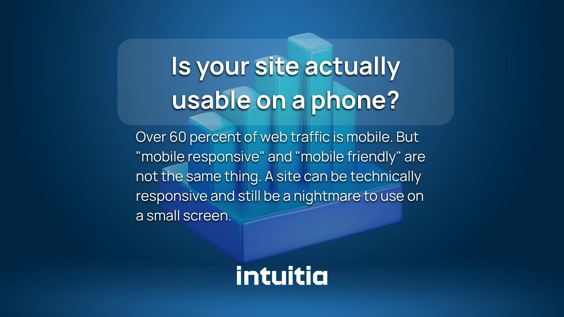
Over 60 percent of web traffic is mobile. But "mobile responsive" and "mobile friendly" are not the same thing. A site can be technically responsive and still be a nightmare to use on a small screen.
Check these specifically on a real phone, not just a browser preview window:
Core Web Vitals are three Google signals that measure how a page feels to use, not just how fast it loads. They directly affect both your search ranking and your conversion rate.
In plain terms: LCP measures how quickly the main content appears. CLS measures how much the page jumps around while loading. FID measures how fast the page responds when someone clicks something. Poor scores on any of these frustrate users before they ever reach your offer.
Check your scores in Google Search Console under the Core Web Vitals report.
A 404 page on a product page or checkout path kills conversions instantly. Run a site crawl monthly. Free tools like Screaming Frog (up to 500 URLs free) or Sitechecker can flag broken links in minutes.
Your visitor decides whether to stay or leave in about 5 seconds. What they see without scrolling makes or breaks that decision. This section covers the most visible, highest-impact real estate on your site.
The value proposition test is simple. Show your homepage to someone who has never heard of your business. Ask them to explain what you do after five seconds. If they cannot, your headline needs work.
A strong above-the-fold headline answers three things: who you help, what problem you solve, and why you are the right choice. You do not need all three in one sentence. But all three should be visible without scrolling.
Good: "Custom dashboards for SaaS teams. Built in days, not months." Weak: "We help businesses grow with innovative digital solutions."
The second example says nothing specific. The first one tells you exactly who it is for and what it delivers.
One primary call to action per page. Research consistently shows that multiple competing CTAs create decision fatigue and reduce total clicks across all of them.
Your CTA button should:
People trust other people more than they trust brands. A star rating, a customer count ("Trusted by 12,000 teams"), or a single strong quote placed near your headline can lift conversions significantly. Most sites bury social proof at the bottom of the page where almost nobody sees it.
Eye tracking research shows users scan in an F or Z pattern. Place your strongest proof element in the natural eye path, not as an afterthought.
Landing pages are where your ad spend either pays off or disappears. A poor landing page wastes every dollar you spend getting people there. A well-built landing page is one of the highest-return investments you can make in your marketing stack.
This is called message match, and it is one of the most common and most fixable CRO problems. If your Google ad says "Free 14-day trial for project managers" and your landing page headline says "The best project management tool," you have a mismatch. Visitors feel confused and leave.
The headline on your landing page should mirror the exact language of the ad, email, or link that brought someone there. The more specific the match, the lower the bounce rate.
Dedicated landing pages should not have a full site navigation. Every link in a nav menu is an exit door. When someone arrives on a landing page, the only path forward should be your CTA.
Remove the header navigation, sidebar links, and footer distractions from any page built specifically for a campaign. Keep the logo. Remove everything else that competes with the conversion goal.
Users read about 20 percent of text on a page, according to the Nielsen Norman Group. So the copy that does get read needs to work hard. Features describe what a product is. Benefits describe what it does for the person reading.
"256GB storage" is a feature. "Never delete a photo again" is a benefit. Write your copy from the visitor's point of view, not from the product's spec sheet.
Real deadlines and genuine stock limits work. Fake countdown timers that reset every time someone visits your page destroy trust the moment a visitor notices. And they do notice.
Use urgency only when it is real. A sale that ends Friday. A cohort that closes when seats fill. That kind of urgency is honest and effective. Manufactured scarcity is a short-term tactic with long-term damage to your credibility.
Every extra field in a form costs you conversions. This is not a theory. It is one of the most consistently proven findings in conversion research. The goal of this section is to make your forms as easy to complete as possible.
Here is a rough benchmark based on form completion research:
Ask only for what you genuinely need right now. You can collect more information later, after the relationship is established. Phone numbers, company size, and job title can almost always wait.
Placeholder text inside a field disappears the moment someone starts typing. That sounds minor. But it creates a real problem when someone pauses mid-form and cannot remember what the field was asking for. Labels above fields stay visible throughout the whole process.
If your form has more than two steps, show a progress indicator. "Step 2 of 3" reduces abandonment significantly because it removes uncertainty. People abandon processes they cannot see the end of.
Single-column form layouts also outperform multi-column layouts on mobile. Keep it simple and vertical.
Around 70 percent of shoppers who reach a checkout page leave without completing the purchase. Most of those abandonments are caused by specific, fixable friction points. Good UX at the checkout stage is not a nice-to-have. It is directly tied to revenue.
Forcing account creation before purchase is the single biggest checkout conversion killer. Many shoppers, especially first-time buyers, do not want to create an account. They want to buy the thing and move on.
Always offer a guest checkout option. You can invite account creation on the confirmation page after the purchase, when the relationship is already established.
Missing a preferred payment method causes direct, measurable drop-off. At minimum, offer credit and debit cards, PayPal or an equivalent digital wallet, and a buy-now-pay-later option. In some markets, local payment methods matter too.
The easier you make it for someone to pay, the more people complete the purchase.
Payment anxiety is real. The moment someone is about to enter their card details, their guard goes up. This is exactly where you need visible security signals.
Show these clearly on every checkout page:
Uncertainty increases abandonment. A simple progress indicator ("Shipping details, Payment, Confirm") tells the buyer exactly where they are and how close they are to the finish line. It costs almost nothing to add and consistently reduces drop-off.
People buy from people they trust. Trust does not happen automatically. You have to build it on the page, at the exact moment the visitor is deciding. Burying your testimonials at the bottom of a page after the fold almost nobody reaches is not a trust strategy.
Place reviews near your CTA, not just on a separate reviews page. A testimonial next to your "Start free trial" button does more work than fifty reviews on a page visitors never scroll to.
Specific testimonials beat vague ones every time. "This helped us increase demos by 34% in six weeks" is worth ten times more than "Great product, highly recommend." Push for numbers and outcomes when you ask customers for reviews.
Here is a quick trust checklist to run through:
Understanding UX design principles helps here too. Trust is partly a design problem. How something looks affects whether people believe it.
You cannot improve what you do not measure. And you should not change what you have not tested. These two rules sound obvious. But most websites skip both.
A KPI is just a number you care about. Conversion rate on a checkout page. Form completion rate on a lead gen page. Click-through rate on a CTA. Pick one per page. If you try to track everything, you end up acting on nothing.
Testing the headline and the button color and the hero image at the same time tells you that something worked. It does not tell you what. Change one element, run the test, wait for a result, then move to the next thing.
Most A/B testing tools calculate statistical significance automatically. Do not call a test a winner until that threshold is reached. Daily traffic fluctuations create false signals. Let the test run.
Do not test random things. Watch your session recordings. Check your heatmaps. Look at where visitors click, where they stop scrolling, and where they seem to get stuck. Then test a fix for the specific problem you observed.
A heatmap showing nobody scrolls past your hero section tells you something urgent. A recording showing users clicking a non-clickable image tells you something specific. Test from evidence, not guesses. Tools like Microsoft Clarity are free and give you this data from day one.
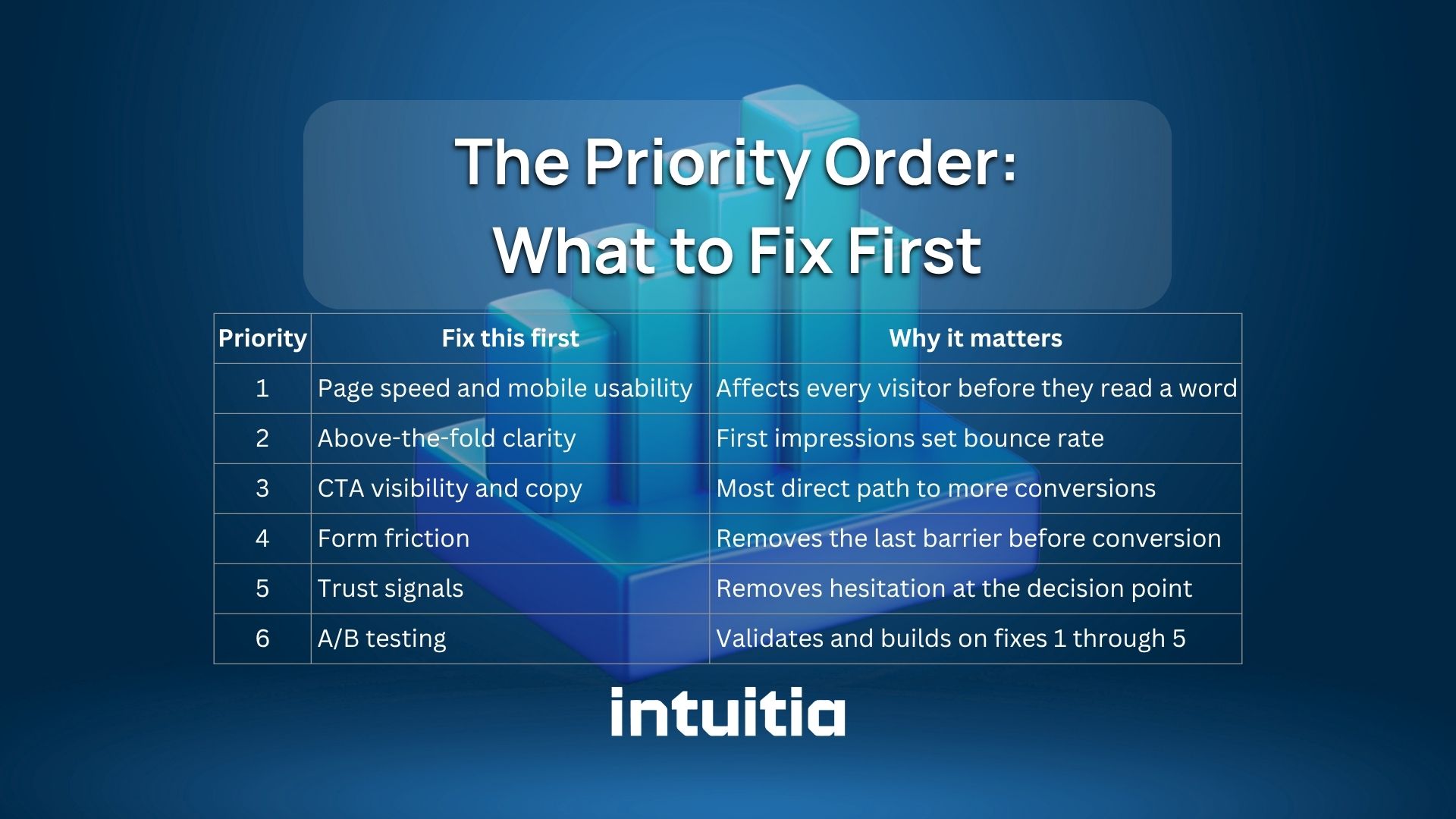
This is what separates a useful checklist from a flat list of 20 things. Not everything deserves equal attention. Here is the order that produces results fastest.
Start at the top. Fix the technical foundation. Then work down. Most businesses that jump straight to A/B testing before fixing page speed and CTA copy end up testing on a broken foundation.
And here is one more thing worth knowing: if your design itself is creating confusion, no amount of testing will fix it. Bad layout, poor visual hierarchy, or unclear navigation are design problems first. How to redesign a website the right way covers that side of the problem in detail.
You do not need to fix everything today. That is actually the wrong approach. Pick the one section in this checklist that matches your biggest problem right now and start there.
If your page loads slowly, start with Section 1. If people arrive but do not click, start with Section 2 or 3. If people almost convert but bail at the form or checkout, that is Section 4 or 5.
One focused fix, properly tested, tells you more than ten scattered changes made all at once.
And if the design of your site is the underlying problem, that is worth looking at properly. Intuitia's UX design consulting helps teams identify exactly where their design is costing them conversions and what to do about it. Take a look if you want a clear starting point.
What is a CRO checklist?
A conversion rate optimization checklist is a structured list of fixes and tests you can apply to a website to increase the percentage of visitors who take a desired action. It typically covers technical performance, design, copy, forms, checkout, trust signals, and testing.
How often should I run through a CRO checklist?
Do a full audit quarterly. Run a lighter check monthly on your highest-traffic pages. Conversion rates change as your traffic mix, products, and market conditions shift. A checklist is not a one-time exercise.
What is a good conversion rate to aim for?
The industry average sits between 2 and 4 percent for most website types. Strong performers in ecommerce and SaaS regularly hit 5 to 10 percent. Landing pages built for specific campaigns can convert higher than that. The right benchmark depends on your industry, traffic source, and offer.
What is the first thing to fix on a low-converting page?
Check page speed and mobile usability first. Then look at whether the headline clearly states the value proposition. Then check if the CTA is visible without scrolling. In that order. Most low-converting pages have at least one of these three problems.
What is message match in CRO?
Message match means the headline and copy on your landing page directly reflect the language used in the ad or link that brought the visitor there. When the message matches, visitors feel like they landed in the right place. When it does not, they bounce.


.svg)


.svg)