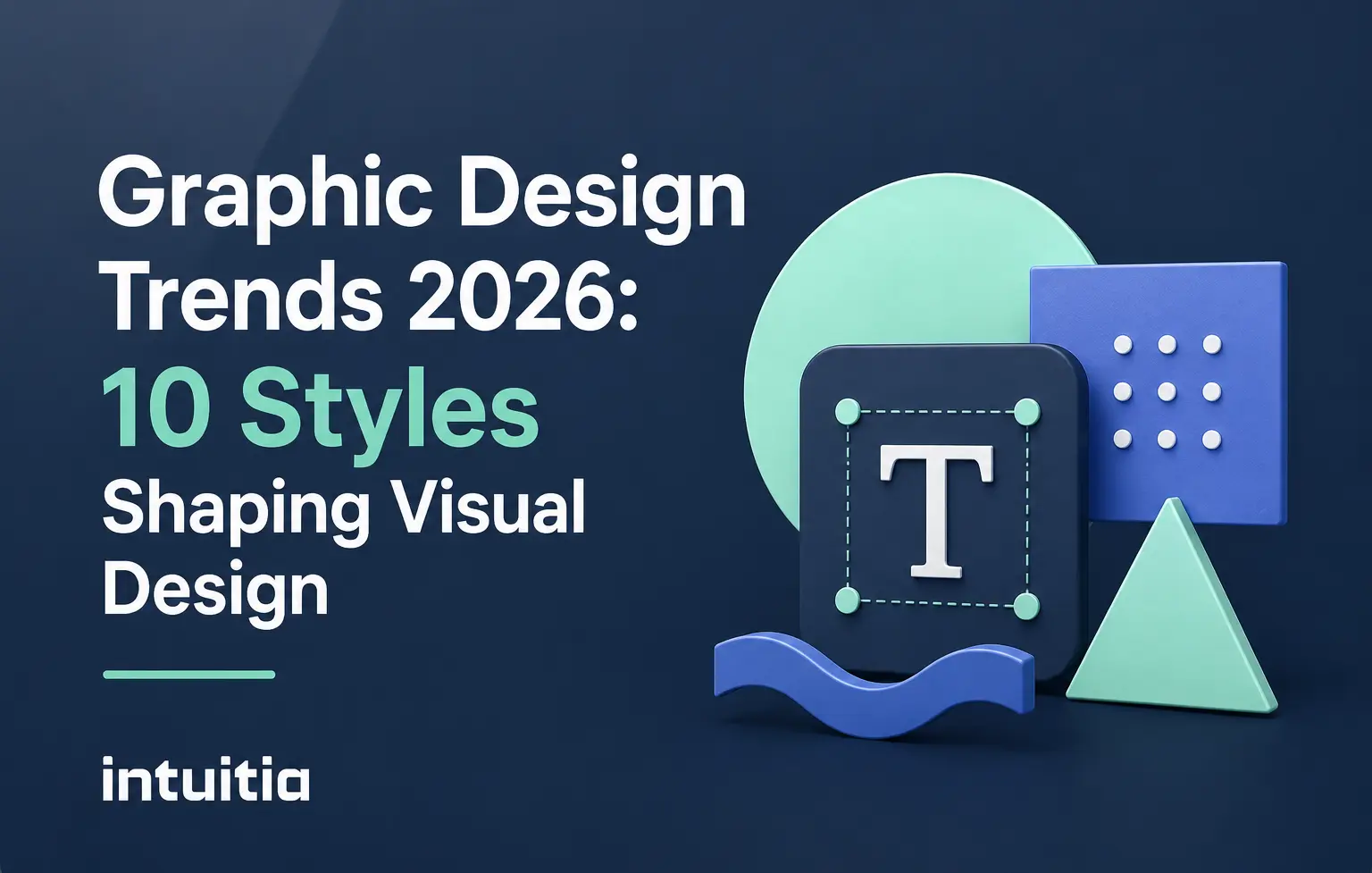
Open any feed right now and you'll notice something odd. The most polished designs are starting to feel the least interesting. That's not an accident. It's the whole story behind graphic design trends 2026.
For years, design got smoother and more perfect. AI tools made flawless gradients and icons available to anyone in seconds. And somewhere along the way, flawless started to feel a little hollow. People stopped pausing on perfect. They started pausing on real.
So this year, designers are pushing back. They're adding grain where there used to be gloss. They're letting type wobble instead of sitting in a perfect grid. They're scanning real paper and shooting real flash photos, leaving the seams visible on purpose.
This guide walks you through the 10 trends graphic design 2026 is actually built on, pulled from current industry reports and real campaigns already in motion. For each one, you'll get the look, the reason it's catching on, and a simple way to try it. No fluff. Just what's working right now.
The short answer is tension. Designers are caught between AI making perfect visuals effortless and audiences craving things that feel handmade.
Think about it like food. Factory bread is convenient, but nobody posts a photo of factory bread. People photograph the lopsided sourdough loaf with flour still on the counter. It feels like someone made it. That's what's happening in design right now. AI gave everyone access to flawless visuals, and that flawlessness became the new wallpaper. Nobody notices wallpaper.
So the trends below all point one way. Texture over gloss. Motion over stillness. Personality over polish. And the smartest brands aren't rejecting AI either. They're using it as a starting point, then roughing up the edges by hand. Keep that tension in mind as you read on, because it explains why almost every trend here exists.
Tactile craft is the trend where designs look stitched, sewn, or cut by hand instead of generated on a screen. It's graphic design that begs to be touched, even though it's still flat on a screen or a page.
Picture embroidery threads, felt textures, paper cutouts with rough glued edges, and Apple's glossy "Liquid Glass" 3D elements that look like they have actual weight. The goal isn't realism. It's warmth. A flat, cold screen suddenly feels like something you could pick up and hold.
This works because screens have started to feel sterile. We scroll past hundreds of flat icons a day, and our brains have gone numb to them. Add a stitched seam or a felt texture and your eye stops. That's the whole point of tactile design. It interrupts the scroll.
Here's how to try it without overcomplicating things:
If you're working on a product or app interface and want this kind of tactile depth done right, a solid UI design process is where that texture gets built into something usable, not just decorative.
Texture pulls people in close. But once they're close, the next trend decides whether what they see feels staged or real.
Reality warp is the move away from polished, staged photography toward gritty, candid shots that look like they came straight off someone's phone. The look: flash photography, light leaks, blurry motion, and slightly off framing, on purpose.
This is sometimes called "Gen Z blur" or "notes app chic," and it's everywhere right now, from fashion campaigns to small business social posts. Instead of a perfectly lit studio shot, you get a flash photo taken at a party, slightly overexposed, maybe a thumb in the corner of the frame. It feels like a memory, not a marketing asset.
People are tired of staged perfection. They scroll past a perfectly lit product shot in half a second, but a slightly messy, real-feeling photo makes them stop and look twice. It reads as honest, and honesty sells better than polish these days. A skincare brand recently swapped its usual studio shots for flash photos taken in a real bathroom, slightly blurry and a bit too bright. Engagement jumped, because it looked like something a friend would send, not an ad.
How to apply this to your own work:
Once you've got the raw, human photography down, the next trend takes that same nostalgic energy and pushes it into typography and interface design.
Digi-cute design blends early 2000s digital nostalgia with playful, toy-like characters and a sense of "vibe coding" fun. Picture pixel grids, spreadsheet aesthetics, and kawaii-style mascots showing up in places you wouldn't expect, like serious branding and app interfaces.
As AI tools get more powerful and a little intimidating, designers are responding by making technology feel playful again. Early computing elements like dropdown menus, loading bars, and spreadsheet grids are getting pulled into design not as functional UI, but as decoration with personality. Bringing back chunky pixel characters and Y2K color palettes is a small rebellion against sleek, sterile AI interfaces. It says technology can still be fun, not just efficient.
This trend fits best in:
If your team is exploring playful UI directions like this, it helps to work with people who specialize in mobile app UI design so the fun stays usable and doesn't get in the way of the actual experience.
Nostalgia and playfulness are fun on the surface, but the next trend digs into something deeper: heritage and slower, more personal storytelling.
Elemental folk design brings hand-drawn nature motifs and cultural heritage patterns into modern layouts, often paired with chaotic, zine-style overlapping elements. In plain terms, it's design that feels like it came from a person's hands and history, not a template library.
Think florals, animals, ornamental borders, and folk patterns rooted in specific regions, mixed with the overlapping, slightly messy layout of an old photocopied zine. It's the opposite of a clean grid. Pages feel layered and intentional in their busyness.
After years of slick digital minimalism, people are craving something rooted in a place or a story. A folk pattern pulled from a specific culture carries meaning a generic icon never will. Picture a coffee shop logo built from a generic bean icon versus one built from a hand-drawn pattern tied to the region the coffee actually comes from. One feels interchangeable. The other feels like it has roots.
Try this in your own work:
Folk and zine design slows things down on purpose. The next trend speeds things back up with type that refuses to sit still.
Absurdist typography means wavy, bubble-like, oversized letterforms that ditch the clean, uniform fonts we're used to seeing everywhere. The short version: type that looks like it's having fun instead of following the rules.
You'll see letters that stretch, squish, bulge, or wobble, often in display headlines rather than body text. It's deliberately exaggerated, not accidental. Feeds are noisy, and everyone's fighting for half a second of attention while someone scrolls. A wild, oversized typographic moment breaks that scroll faster than almost anything else on the page. It signals personality before a reader even processes the words.
A useful rule of thumb here is contrast. Pair one absurdist headline with a calm, simple layout around it. If everything on the page is loud, nothing stands out. But one wobbly, oversized word against a clean background grabs attention and holds it.
Quick ways to apply this:
Loud, expressive type earns attention. But sometimes the boldest move is doing less, which brings us to the next trend.
Neo-minimalism strips back visual clutter into clean layouts, then adds one bold color pop or a small intricate detail to keep things from feeling flat. It's minimalism that still has a pulse.
The look pairs a calm, structured layout with something unexpected, like a single striking color, often called Cool Blue this year, or a tiny flourish hidden in an otherwise simple design. People are overstimulated almost constantly between notifications, ads, and autoplay videos, so a clean layout reads as relief. It's the visual equivalent of walking into a quiet room after a loud party. That one bold color pop keeps it from feeling boring.
Brands in wellness, finance, or professional services often benefit most, since calm and trustworthy are exactly the feelings they want to create.
If you're rethinking your visual identity around this calmer, more intentional direction, it often starts with a proper UX design consulting process to make sure the simplicity actually serves the user, not just the aesthetic.
Calm design has its place. But some brands want the opposite, and that's exactly what the next trend delivers.
Neo-brutalism is graphic design that leans into raw layouts, oversized typography, and intentional friction instead of smoothing everything out. It looks unrefined on purpose, and that's exactly the point.
Picture stark color contrasts, chunky borders, deliberately clashing fonts, and layouts that feel a little confrontational. Every rough edge is a choice, made to feel bold rather than safe. In a feed full of soft gradients and rounded corners, a harsh, high-contrast layout stops people cold. It reads as confident, almost rebellious, which is exactly the energy a lot of startups and challenger brands want right now.
This style fits best for:
Neo-brutalism isn't for every brand though. A healthcare app probably shouldn't look confrontational. But for the right audience, it's one of the fastest ways to look unmistakably different.
Raw and bold works in isolation. But the next trend takes that same rejection of flatness and turns it into layered, dimensional storytelling.
Mixed-media design layers photography, illustration, typography, and texture into a single composition instead of keeping everything flat and separate. The quick answer: it's collage, built deliberately, to feel rich and dimensional rather than simple.
You'll see torn paper edges sitting next to digital illustration, a photo cropped into an odd shape overlapping hand-drawn type, and textures stacked on top of each other until the whole piece feels almost three-dimensional, even though it's flat on a screen.
This trend taps into a basic human preference. Flat, single-layer design is easy to produce but easy to forget. Layered, mixed-media work takes more effort to look at, and that effort is exactly what makes it memorable. Your eye has to work a little to take it all in, and that work creates engagement.
Here's a simple way to start:
Layered, dimensional design tells a richer story in a single frame. But some brands need that story to move, not just sit still, which is exactly where the next trend comes in.
Motion-first branding means logos, typography, and visual systems are designed to move from the very start, not animated as an afterthought. The short answer: brands in 2026 are built to feel alive across screens, not just look good when frozen in a still image.
This isn't about adding a flashy intro animation to a logo once a year. It's about designing the actual identity with movement baked in. A logo might subtly shift shape depending on context. Typography might have a built-in animated state for digital use. The brand has rhythm, not just a static look.
Why does this matter now? Because almost every brand interaction today happens on a screen, and screens move. A static logo on a moving, scrolling, swiping interface can feel oddly lifeless, like a photo of a person instead of the person themselves. Motion makes a brand feel present and responsive instead of just printed onto a digital surface.
You don't need a huge budget to start here. Try this:
If motion and product experience are both part of your roadmap, a 2D/3D design approach can help bring static brand assets into a moving, responsive system without starting from scratch.
Motion gives a brand presence. And presence matters even more when you consider who, or what, is actually doing the designing, which brings us to the final trend.
In 2026, the strongest design teams use AI to explore ideas fast, then refine everything by hand before it ships. That's the real shift. AI isn't a replacement for a designer's judgment anymore. It's a tool that hands a designer more raw material to shape.
Early AI design felt like a shortcut. Type a prompt, get a finished image, done. But that approach produced visuals that all started to look strangely similar, smooth, generic, a little soulless. The best work happening right now uses AI differently. Designers generate dozens of rough directions fast, then pick the most interesting one and rebuild it with intention, texture, and a human hand.
Think of AI here like a sketchbook that fills itself in seconds. It's not the final drawing. It's a faster way to get to the first ten ideas so a designer can spend their actual time and skill on the one idea worth finishing properly.
This matters for your workflow no matter your skill level. If you're not a trained designer, AI can hand you a rough starting point you'd never have reached on your own. And if you are a trained designer, AI just gives you more raw options to react to before you put in the real craft.
A practical way to apply this:
AI handles speed. Humans still handle meaning. And once you've got a sense of all 10 trends, the real question becomes which ones actually belong in your work.
The right trend for your brand depends on three things: your audience, your brand personality, and where people actually see your design. Skip the trends that don't match at least two of those three.
Start with your audience. A playful, Gen Z-leaning brand can run wild with absurdist typography or digi-cute nostalgia. A B2B software company probably can't, and that's fine. Borrowing the wrong trend for the wrong audience usually backfires, since it can read as try-hard instead of authentic.
Next, think about your brand's existing personality. If your brand has always been calm and trustworthy, neo-brutalism is going to feel jarring, not bold. But neo-minimalism with one striking color pop might be exactly the refresh you need. Trends should amplify what your brand already is, not fight against it.
And finally, think about platform. Motion-first branding matters far more if most of your audience meets you on social video or an app. Tactile, texture-heavy design matters more in print, packaging, or anywhere people can imagine touching the piece. Match the trend to where people actually encounter your work.
Here's a simple way to narrow it down fast:
If you're not sure where your brand fits, that's a completely normal place to start from. A short conversation usually clears it up faster than guessing alone. The team at Intuitia works through exactly this kind of brand and design direction with clients regularly, and the contact page is the easiest way to start that conversation if you want a second opinion before committing to a direction.
Once you've picked a direction that fits, the last step is just getting started without overthinking it.
Graphic design trends 2026 all point toward one idea. People can feel the difference between something made with intention and something made on autopilot, and they're choosing intention every time.
You don't need to chase every trend on this list. Pick one or two that genuinely fit your brand and your audience, then commit to them properly instead of sprinkling a little bit of everything together. A trend half-used rarely lands. A trend fully understood and applied with care almost always does.
So take one idea from this guide. Maybe it's a textured overlay, maybe it's a single absurdist headline, maybe it's just letting your next photo be a little less perfect. Try it on your next project and see how it feels. Design trends come and go, but designing with intention never goes out of style.


.svg)


.svg)