
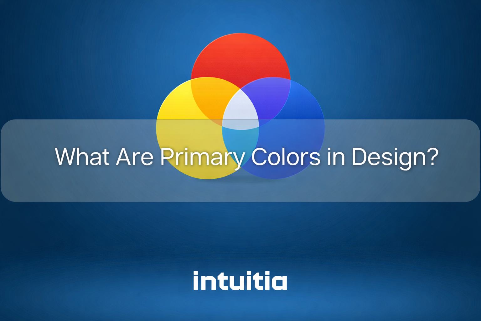
Every color you see starts somewhere. That somewhere is primary colors.
Primary colors in design are the fundamental building blocks that cannot be created by mixing other colors together. They form the foundation of color theory and shape how designers create visual experiences across different mediums. Whether you are working on a website, painting a canvas, or designing a brand identity, understanding primary colors helps you make intentional choices that resonate with your audience. Professional UI design teams leverage these fundamentals to create cohesive visual systems.
The concept sounds simple, but here is where it gets interesting. Primary colors change depending on whether you are mixing paint, designing for a screen, or preparing files for print. Each medium has its own set of primaries, and knowing which system to use can make or break your design work.
Primary colors are the pure hues that serve as the starting point for all other colors. You cannot create them by mixing other pigments or colors of light together. This non-derivative nature makes them essential to color theory.
The color wheel visualizes how these foundational colors relate to each other. When you mix primary colors in specific combinations, you create secondary colors. Mix those secondaries with primaries, and you get tertiary colors. This hierarchical system explains why primary colors hold such importance in both traditional art and modern design.
Here is what makes a color "primary" in any system:
The three primary colors work as anchor points. Everything else in the color spectrum derives from their combinations and variations.
Not all primary colors are created equal. The primaries you learned in elementary school might not match what you use in your design software. That is because different mediums rely on different color models.
Understanding these distinctions helps you avoid costly mistakes when your designs move from screen to print or from digital mockup to physical product.
The RYB color model uses red, yellow, and blue as its foundation. Artists have relied on these three pigment-based colors for centuries when mixing paints and creating physical artwork.
When you combine red and yellow, you get orange. Mix yellow and blue together, and green appears. Blend blue and red, and purple emerges. These secondary colors demonstrate how the 3 primary colors in art generate the full spectrum through subtractive color mixing.
The RYB model dominates traditional painting and art education because it reflects how pigments behave when physically combined. As you add more colors together, the mixture becomes darker. This subtractive process differs fundamentally from how colors of light interact.
Digital screens use an entirely different system. The RGB color model relies on red, green, and blue as the primary colors of light.
Your monitor, phone, and television create every color you see by combining these three colors of light in varying intensities. This additive color mixing means that when all three primaries combine at full intensity, they produce white light. Zero intensity across all three creates black.
Here is how RGB colors work in practice:
The additive color system explains why your design might look different on screen versus in print. Understanding this relationship between additive and subtractive models saves designers from unwanted surprises during production.
Print design requires yet another approach. The CMYK color model uses cyan, magenta, yellow, and black (the K stands for "key") as its foundation for reproducing colors on paper.
Printers use subtractive color mixing, similar to traditional paint but with different primaries. As inks layer on white paper, they absorb (or subtract) certain wavelengths of light. The combination of cyan, magenta, and yellow theoretically produces black, but printers add pure black ink for deeper, richer darkness and sharper text.
Professional designers convert RGB files to CMYK before sending them to press. This conversion often shifts colors slightly because the two systems have different color ranges. Bright, saturated colors that shine on screen may appear duller in print, which is why test prints matter for critical projects.
Color theory builds its entire framework on the relationships between primary, secondary, and tertiary colors. These connections create harmony, contrast, and visual interest in design work.
Secondary colors emerge when you mix two primary colors together. Orange, green, and purple sit between the primaries on the color wheel. Tertiary colors appear when you combine a primary with an adjacent secondary, creating nuanced hues like red-orange or blue-green.
The color wheel shows how these relationships create balance. Complementary colors sit opposite each other and create maximum contrast. Analogous colors cluster together and produce harmonious combinations. Split-complementary schemes use one base color plus the two colors adjacent to its complement.
Designers use these principles to guide color choices that feel intentional rather than random. The role of primary colors extends beyond simple mixing. They anchor every color scheme and provide reference points for creating visual hierarchy.
Colors trigger emotional responses whether we notice them consciously or not. The three primary colors each carry distinct psychological associations that designers leverage to influence user behavior and brand perception.
Red demands attention. This primary color increases heart rate and creates a sense of urgency that makes it perfect for call-to-action buttons and sale announcements.
Brands in the food industry use red frequently because it stimulates appetite. Fast food chains and restaurant logos often feature red prominently. The color also signals passion, energy, and confidence, which is why technology companies and sports brands incorporate it into their identities.
The psychological effect of red makes it powerful but risky. Too much red can feel overwhelming or aggressive. Designers balance it with neutral tones or use it sparingly as an accent color for maximum impact.
Yellow radiates positivity. As the brightest color in the visible spectrum, it naturally draws the eye and conveys happiness, optimism, and creativity.
This primary color works well for:
Yellow in design requires careful handling. Pure, saturated yellow can strain the eyes and become difficult to read, especially on white backgrounds. Designers often adjust its brightness or pair it with darker colors for better readability while maintaining its cheerful essence.
Blue dominates corporate branding for good reason. It conveys trustworthiness, stability, and professionalism more effectively than any other primary color.
Financial institutions, healthcare providers, and technology companies favor blue because it reduces anxiety and promotes feelings of security. The color also represents intelligence, efficiency, and reliability. Social media platforms use blue extensively because it encourages prolonged engagement without causing visual fatigue.
Different shades of blue create different moods. Light blue feels peaceful and open, while navy blue suggests authority and expertise. This versatility makes blue the most widely used primary color in branding and user experience design.
Primary colors shape how audiences perceive and remember brands. Their psychological impact and universal recognition make them essential tools for building strong visual identities.
Brand identity relies heavily on color consistency. When companies use primary colors strategically, they create instant recognition. McDonald's golden arches work because that specific yellow pairs with red to trigger immediate brand recall. The importance of primary colors becomes clear when you consider how many global brands build their identities around these fundamental hues.
User experience improves when designers apply primary colors thoughtfully. Visual hierarchy guides users through interfaces, and primary colors help establish that hierarchy. A blue primary button signals the main action. Red warns of errors or deletions. Yellow highlights important updates without demanding immediate action. This strategic approach to mobile app UI design ensures users understand interface elements intuitively.
Design consistency across platforms depends on understanding how primary colors behave in different contexts. Your brand's primary color needs to work on screens, in print, on packaging, and in physical spaces. This consistency builds trust and reinforces brand recognition every time someone encounters your visual identity. Choosing the right website color scheme from the start prevents costly redesigns later.
Theory means nothing without application. Real-world design projects demonstrate how primary colors create functional, beautiful solutions across different mediums.
Digital interfaces rely on primary colors to guide user behavior and create intuitive experiences. UI color design establishes visual patterns that users recognize instinctively.
Call-to-action buttons typically use high-contrast primary colors that stand out from surrounding elements. Blue buttons suggest safe, positive actions. Red indicates destructive changes or urgent decisions. Green confirms success or completion. Effective landing page design relies heavily on these color psychology principles to drive conversions.
Primary colors in web design also improve accessibility when applied correctly. Sufficient contrast between text and background colors ensures readability for users with visual impairments. Tools that check color contrast ratios help designers meet WCAG standards while maintaining their intended aesthetic.
Navigation elements often use a single primary color to create consistency throughout an interface. This approach reduces cognitive load because users learn the visual language quickly and navigate more confidently. When planning mobile app UX design, color consistency across screens becomes essential for seamless user journeys.
Print and digital marketing materials use primary colors to capture attention and communicate messages quickly. The marketing color strategy often starts with selecting a dominant primary that aligns with the brand's personality and campaign goals.
Product packaging uses primary colors to differentiate items on crowded shelves. Children's products often feature bold primaries because they appeal to both kids and parents. Luxury brands might use a single primary color as an accent against neutral backgrounds to suggest sophistication.
Brand color palettes typically include one or two primary colors supported by secondary and neutral tones. This structure provides flexibility while maintaining consistency. A complete palette might include a primary blue for trust, a secondary orange for energy, plus neutral grays for balance. Understanding these relationships becomes crucial when working on comprehensive product design projects that span multiple touchpoints.
Knowing the theory is one thing. Applying it successfully requires attention to specific guidelines that prevent common pitfalls and maximize impact.
Start with accessibility. Color contrast matters more than personal preference. Text needs sufficient contrast against its background to remain readable. Primary colors work beautifully when you test them against WCAG contrast requirements before finalizing your designs.
Maintain consistency across platforms. Your primary color should look intentional whether someone sees it on a website, business card, or billboard. This means understanding color space conversions and testing your primaries in RGB, CMYK, and Pantone systems.
Balance is everything. Using all three primary colors equally creates visual chaos. Choose one primary color as your dominant hue, use a second as an accent, and reserve the third for rare emphasis. The 60-30-10 rule provides a helpful framework. Sixty percent of your design uses a dominant color, thirty percent uses a secondary color, and ten percent uses an accent.
Consider cultural context. Primary colors carry different meanings in different cultures. Red signals good fortune in China but can indicate danger in Western contexts. Research your audience's cultural associations before committing to a primary color strategy. Professional UX design consulting helps navigate these nuances for global products.
Test early and often. Colors appear different on various screens and paper stocks. Print samples before production runs. Check your designs on multiple devices. What looks perfect on your calibrated monitor might appear washed out on a typical smartphone.
Even experienced designers fall into predictable traps when working with primary colors. Recognizing these mistakes helps you avoid them in your own work.
Overusing primary colors ranks as the most frequent error. When every element screams for attention, nothing stands out. Primary colors work best as focal points, not as all-encompassing backgrounds. They should guide the eye, not overwhelm it.
Ignoring color context causes designs to fail across different applications. A primary color that looks vibrant in RGB might appear dull in CMYK. Designers who skip color space testing often face disappointing results when their work goes to print.
Poor color contrast makes designs unusable for significant portions of your audience. Pairing primary colors without checking readability creates accessibility barriers. Yellow text on white backgrounds, light blue text on darker blue backgrounds,these combinations look interesting but fail functional requirements.
Forgetting about color blindness excludes roughly eight percent of men and half a percent of women from fully experiencing your design. Relying solely on red versus green to convey information leaves these users confused. Always provide alternative cues like icons, patterns, or text labels alongside color coding.
Primary colors form the foundation of every visual decision you make as a designer. Whether you work with the red, yellow, and blue of traditional art, the RGB primaries of digital screens, or the CMYK system of professional printing, these fundamental hues shape how audiences experience your work.
The principles remain consistent across mediums. Primary colors create emotional responses, establish visual hierarchy, and build brand recognition. When you apply them with intention,understanding their psychological impact, respecting accessibility guidelines, and maintaining consistency,you create designs that communicate clearly and resonate deeply.
Effective design starts with mastering the basics. Now that you understand how primary colors work across different systems and contexts, you can make informed choices that elevate your projects from functional to exceptional.
Are primary colors the same everywhere?
No, primary colors change based on the medium you are working with. Traditional art uses red, yellow, and blue (RYB). Digital design relies on red, green, and blue (RGB). Professional printing requires cyan, magenta, yellow, and black (CMYK). Each system serves different needs and produces different results when mixing colors.
What is the difference between RGB and RYB?
RGB is an additive color system where mixing all primaries creates white light. It powers digital screens and displays. RYB is a subtractive system used in traditional painting where mixing all primaries produces a muddy brown or black. RGB uses light, while RYB uses pigments.
Do primary colors affect conversions?
Yes, color choice influences user behavior significantly. Studies show that the color of call-to-action buttons can change conversion rates by meaningful percentages. Red creates urgency, blue builds trust, and yellow draws attention. However, contrast and placement matter just as much as color selection itself.
How do primary colors impact user behavior?
Primary colors trigger immediate emotional and psychological responses. Red increases heart rate and creates urgency. Blue reduces anxiety and promotes trust. Yellow captures attention and conveys optimism. Designers use these effects strategically to guide users toward desired actions and create specific brand perceptions.


.svg)


.svg)