
Most B2B websites do one thing really well: they look like every other B2B website.
Same vague headline. Same stock photo of a handshake. Same "Contact Us" button buried at the bottom. And then people wonder why the site is not generating leads.
Here is the truth: your B2B website is not a digital brochure. It is your best salesperson. It works 24 hours a day, seven days a week, and it is often the first thing a potential customer sees before they ever talk to anyone on your team. So it needs to do real work.
This guide walks you through what actually works in B2B website design, why it works, and how you can apply it to your own site today.
A B2B (business-to-business) website is a site that promotes or sells products and services from one business to other businesses. It is not selling to individual consumers. It is selling to procurement managers, CTOs, marketing directors, and buying committees.
That changes everything about how you design it.
According to Grand View Research, the global B2B ecommerce market is forecast to reach $20.9 trillion by 2027, growing at a 17.5% annual rate. The B2B website is no longer optional. It is the center of your entire sales and marketing operation.
It educates. It builds trust. It generates leads. And it supports your sales team by doing the heavy lifting before a prospect ever gets on a call.
Forrester research found that B2B buyers are already 57% to 70% through their buying journey before they ever reach out to a vendor. That means your website is doing the selling long before your sales team enters the picture.
A well-built B2B website also reduces the cost of sales. When buyers can find clear answers, product specifications, and proof of results on their own, your sales team spends less time on education and more time on closing.
This is one of the most common questions, and it matters a lot. B2B and B2C websites serve different audiences with very different buying behaviors.
According to Gartner, the typical B2B purchase involves 6 to 10 decision makers, each doing their own independent research. And 77% of B2B buyers describe making a purchase as "very complex or difficult." Compare that to a B2C consumer buying a pair of sneakers on impulse.
Here is a clear breakdown of the key differences:
The biggest mistake B2B companies make is copying B2C design patterns. What works for an online retail store will not work for enterprise software. B2B buyers are not impulse shoppers. They research, compare, consult colleagues, and then decide. Your website needs to support that entire process.
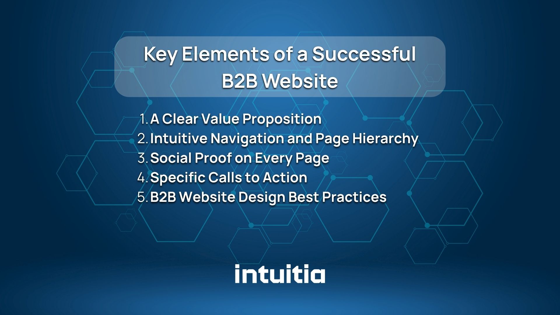
A high-performing B2B website is not about looking impressive. It is about making things easy for your buyer. Here are the core elements every successful B2B website needs.
Your value proposition is the single most important line on your website. It tells visitors exactly what you do, who you help, and why you are the right choice. And it needs to be front and center on your homepage, above the fold, before anyone scrolls.
Here is a simple test from Orbit Media called the "backyard BBQ test." Imagine meeting someone at a party. They ask what your company does. Would you respond with your homepage headline? If not, rewrite it.
Dropbox is a great example. Their homepage does not just say "file storage." It explains sharing, tracking, and signatures. It answers the question "Is Dropbox able to..." before anyone has to ask.
Your navigation tells visitors where they are and tells search engines what you do. Vague labels like "Solutions" or "Services" do not help either one.
Use descriptive labels. "UX Design for SaaS Products" is better than "Services." Build a clear site map that follows your buyer's journey from awareness to decision. And if you have a large site, consider a mega menu. It shows more options upfront and reduces the friction of digging through dropdowns.
Social proof is evidence that other people trust you. And in B2B, trust is everything.
The key insight from Orbit Media's research: do not create a standalone testimonials page. Nobody visits it. Instead, add testimonials, client logos, certifications, and awards to every service page. Put them near the top, not buried at the bottom.
Studies show that 94% of first impressions are based on design. When a buyer lands on your page, they are making a snap judgment. Client logos and recognizable brand names instantly signal credibility.
The standard "Contact Us" button is fine, but it is not great. Research shows that more specific CTAs get higher click rates. "Book a Free Strategy Call" outperforms "Contact Us" every time.
Think about what the next logical step is for your visitor. Sometimes it is a contact form. But often it is a case study, a demo, or a service page. Use your analytics to find out which pages lead to conversions and guide people there.
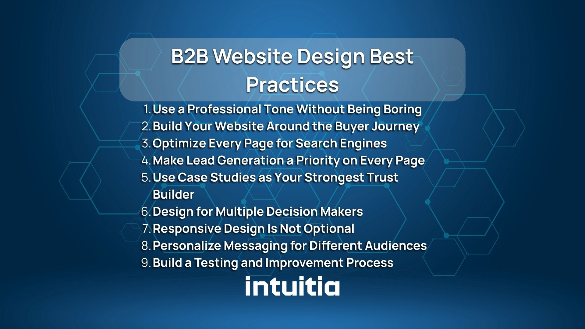
Here is where things get practical. These are the design and content practices that consistently produce results for B2B companies.
B2B buyers are professionals. They know their industry. So you can use industry-specific terms without over-explaining them. Technical specifications that would confuse a general consumer are often exactly what your B2B buyer needs to make a decision.
That said, professional does not mean dull. Write like a knowledgeable colleague, not a legal document. Clear, direct, and confident.
Here is a practical way to think about it. Read your homepage copy out loud. If it sounds like something a real person would say in a meeting, you are on the right track. If it sounds like it was written by a committee and approved by legal, it needs a rewrite.
B2B buyers respond to clarity above all else. They are busy people evaluating multiple vendors. The site that gives them the clearest picture of what they get and why it matters will win their attention.
Your B2B buyer goes through several stages before they are ready to buy. They start by recognizing a problem, then researching solutions, then comparing options, then deciding.
Your website needs content for each of those stages:
If your website only speaks to people who are ready to buy right now, you are missing the majority of your potential customers. Most people visiting your site are still in research mode.
For a deeper look at structuring content around the user journey, the b2b ux design agency guide covers how UX decisions connect directly to conversion outcomes.
SEO is not just about getting traffic. It is about getting the right traffic. Here is the thing about B2B SEO: your service pages need to rank for commercial-intent phrases. These are the searches people make when they are actively looking for what you sell.
Your blog content serves a different purpose. It builds domain authority by attracting links, which then helps your service pages rank. Without strong blog content, your service pages may never appear in organic search results.
Key on-page SEO practices for B2B websites:
One thing many B2B companies miss: blog posts do not often convert visitors directly. But they attract backlinks from other sites, which raises your domain authority, which makes your service pages more likely to rank. It is an indirect relationship, but it is one of the most important ones in B2B digital marketing.
Also worth noting: B2B keyword research works differently than B2C. Your target phrases often have lower search volume but much higher commercial value. A phrase searched 200 times per month that converts at 5% is worth far more than a phrase searched 10,000 times that converts at 0.1%.
For more detail on how UX design and SEO work together, check out this guide on ux conversion rate optimization.
Lead generation is the primary job of most B2B websites. But a lot of companies treat it as an afterthought.
Here is what works:
The goal is to give visitors a reason to hand over their email before they are ready to buy. That way you can continue the conversation through email marketing and nurture them toward a decision.
Generic claims like "we deliver results" mean nothing. Case studies do the opposite. They show a real problem, a real solution, and a real result. That is the format that builds trust with B2B buyers.
A good case study follows a simple structure: here is the problem the client had, here is what we did, and here is what happened. Include numbers wherever possible. "Reduced customer support calls by 40%" is far more convincing than "improved efficiency."
Place case studies on your homepage, on relevant service pages, and in a dedicated case studies section. Do not hide them in a corner. They are some of your most valuable sales material.
Here is something most B2B companies get wrong with case studies: they write them from their own perspective. They focus on what they did and how clever the solution was. But the buyer reading your case study is not thinking about you. They are thinking about themselves.
Write your case studies from the client's point of view. Start with the challenge they were facing. Make it specific enough that your target buyer recognizes themselves in it. Then walk through the solution and land on concrete outcomes. That is the version that actually moves people toward a decision.
Remember those 6 to 10 decision makers Gartner mentioned? They are not all the same person. A technical evaluator cares about specifications and integrations. A financial decision maker cares about ROI and cost. A department head cares about day-to-day workflow impact.
Your website needs to speak to all of them. That means creating content that addresses different concerns, using clear navigation that lets each persona find what they need quickly, and making sure your value proposition resonates beyond just one job title.
More B2B buyers are researching on mobile devices than ever before. A site that looks broken on a phone sends an immediate signal of unprofessionalism.
Responsive design means your site adjusts automatically to any screen size. It also means fast load times. Page load speed affects both your search engine rankings and your bounce rate. If your site takes more than three seconds to load, a significant portion of visitors will leave before seeing anything.
Research shows it takes just 0.9 seconds for a visitor to form an opinion about your website. That is less than one second to make a first impression. If your site is slow, cluttered, or hard to navigate on a phone, that impression will not be a good one.
ADA accessibility compliance also matters here. Clear navigation, readable fonts, and proper contrast ratios do not just help users with disabilities. They make the entire site easier to use for everyone. And in many regions, accessibility compliance is becoming a legal requirement, not just a good practice. Automated scanning tools can catch obvious issues, but manual testing is also necessary to catch the things tools miss.
If you serve multiple industries or buyer types, personalization can significantly improve your conversion rate. This does not require complex technology. Even simple things like separate landing pages for different audiences can make a big difference.
For example, a landing page for a manufacturing company should use different language, examples, and case studies than a landing page for a SaaS company. The core service might be the same, but the message should feel specific to them.
This is closely tied to how you create buyer personas. The how to create a persona guide walks through building personas that actually inform your design and messaging decisions.
Here is what separates a good B2B website from a truly high-performing one: a habit of testing.
Best practices give you a starting point. But your audience is unique. What works for IBM may not work for you. The only way to know what works for your visitors is to test it.
Use A/B testing to compare different headlines, CTAs, or page layouts. Use heatmaps and session recordings to see where people click, scroll, and drop off. Check your bounce rate and time on page in Google Analytics regularly. Then use what you learn to make improvements.
This is an ongoing process, not a one-time project.
A simple way to get started: pick your highest-traffic service page and run one test on it. Change only the headline or only the CTA. Run the test for at least two to four weeks to get enough data. Look at your conversion rate before and after. If the new version wins, keep it. If not, try something else.
The companies that consistently outperform their competition are not necessarily the ones with the biggest budgets. They are the ones that test the most and learn the fastest.
If you are starting from scratch or planning a redesign, here is the strategic sequence that works.
Start with data, not aesthetics. Use Google Analytics to audit your existing site if you have one. Find your best-performing pages and understand why they work. Use Google Search Console to find technical errors and keyword opportunities.
Then look at your competitors. What are they doing well? Where are the gaps you can fill? Competitor research is not about copying. It is about differentiating.
Also worth reading: market research vs user research explains how to use both to build a website that actually connects with your buyers.
Your keyword strategy should identify commercial-intent phrases for your service pages and informational phrases for your blog content. Map each keyword to a specific page.
Then build your site map. This is a blueprint of every page on your site and how they connect. Your site map should follow your buyer's journey and reflect your keyword strategy. Every page should have a clear purpose.
If you are planning a full website redesign, the guide on how to redesign a website covers how to approach the process without losing your existing SEO value.
Once you have your strategy, build your wireframes. A website wireframe is a structural sketch of each page before any visual design is applied. It forces you to think about content hierarchy before colors and fonts.
Key principle: design for your buyer's information needs, not your own preferences. What does your buyer need to know at each stage? What questions do they have? What objections do they need resolved?
For the visual design phase, the ux design principles guide covers the core ideas that make interfaces feel intuitive rather than confusing.
Your content needs to answer your buyer's questions, address their concerns, and build confidence in your ability to help them. Start with your value proposition. Then work through each service page, making sure it covers:
After launch, set up proper tracking in Google Analytics. Monitor your conversion rate, bounce rate, time on page, and organic search traffic. Pay close attention to your most important service pages.
Then start your testing program. Pick one thing to test at a time. Run the test long enough to get statistically meaningful results. Apply what you learn. Repeat.
Looking at real examples is one of the best ways to understand what good B2B website design actually looks like in practice.
IBM structures its site to serve multiple buyer personas simultaneously. Navigation is clear and role-based. Case studies are prominent. And every major section has a strong, specific CTA. What IBM does particularly well is making a complex product portfolio feel navigable. A first-time visitor can quickly orient themselves and find what is relevant to their role and industry.
Mailchimp does an excellent job explaining a complex product in simple language. Their homepage answers the "what is this and why do I need it" question immediately. Social proof is woven throughout, not saved for a separate page. They also use plain, conversational language that feels approachable without sacrificing credibility.
Dropbox proactively overcomes objections on the homepage. Instead of waiting for buyers to wonder "can it do X?", they answer those questions before they are asked. That is smart B2B website design. Their page structure essentially runs through a mental checklist that a procurement manager might have and checks every box.
AGIA Affinity, built on the Liferay platform, is a great example of a B2B website designed for a specific, technical audience. Clear information architecture, easy navigation, and reduced support call volume as a direct result of better website usability. The lesson here is that great B2B website design does not just look good. It saves operational costs too.
Cobalt Robotics is worth looking at for how they handle a highly technical product for a non-technical buyer. They lead with outcomes ("safer facilities, lower costs") rather than features ("autonomous patrol robots"), which is the right instinct for a B2B audience making a significant investment decision.
The common thread across all of them: they make it easy for the buyer to find what they need, build confidence quickly, and take a clear next step.
For more examples of well-designed digital products, the portfolio shows real work across different industries and use cases.
You cannot improve what you do not measure. Here are the key metrics to track for a B2B website.
Focus your attention on your service pages and homepage first. These are the highest-stakes pages on your site. If visitors are leaving quickly, look at your headline, your value proposition, and your social proof. If they are staying but not converting, look at your CTA placement and your lead capture forms.
Most B2B website problems come from the same few mistakes. Here is what to watch out for:
Leading with your company story instead of your buyer's problem. Your buyer does not care about your founding story on the first visit. They care about whether you can solve their problem. Lead with that. Save the company story for the About page, where people who already trust you will find it.
Hiding pricing without explanation. B2B pricing is often custom. That is fine. But say so. "Pricing depends on your team size and needs. Contact us for a quote." That is honest. Leaving visitors to wonder signals a lack of transparency and costs you leads.
Using vague navigation labels. "Solutions" tells nobody anything. "Customer Support Software" tells everyone exactly what to expect. Descriptive labels help your visitors and help search engines understand what your pages are about. Both matter.
No social proof on service pages. If your testimonials only live on a dedicated testimonials page, most buyers will never see them. Move your strongest testimonials to the pages where people are making decisions, which is your service pages and homepage.
Treating the website as a finished product. A B2B website is never finished. The companies that win are the ones that treat it as an ongoing asset to improve. Launch it, then keep working on it.
Ignoring mobile optimization. B2B buyers research on phones too. A broken mobile experience is a missed opportunity and a signal that your attention to detail is lacking.
Writing for yourself instead of your buyer. This is the most common mistake. You know your product deeply, so you write about features. Your buyer cares about outcomes. Translate every feature into a benefit and every benefit into a business result.
Build a B2B Website That Works as Hard as Your Sales Team
Your B2B website has one job: help the right buyers understand what you do, trust that you can help them, and take the next step.
That is not complicated in theory. But it takes real work in practice. It means understanding your buyer deeply, designing around their needs, writing content that answers their real questions, and then testing and improving continuously.
The companies that get this right do not just have better websites. They have better pipelines, shorter sales cycles, and sales teams that spend less time educating and more time closing.
Start with one thing. Maybe it is rewriting your homepage headline. Maybe it is adding a case study to your main service page. Maybe it is setting up proper tracking in Google Analytics so you finally know what is working.
One improvement leads to another. And that is how a B2B website becomes something you are genuinely proud of.
If you want help making that happen, the team at Intuitia works with B2B companies on exactly this. Take a look and reach out when you are ready.
What is the most important element of a B2B website?
A clear value proposition is the single most important element. If visitors cannot understand what you do and why it matters within a few seconds of landing on your homepage, they will leave.
How is B2B website design different from B2C website design?
B2B website design serves longer sales cycles, multiple decision makers, and more complex buying processes. It focuses on education, trust-building, and lead generation rather than immediate transactions.
How do I optimize my B2B website for lead generation?
Place lead capture forms prominently on your pages. Offer valuable downloadable resources. Use specific CTAs that reflect the next logical step. And make sure your service pages answer your buyer's top questions clearly.
What role does content play in B2B website design?
Content is the backbone of a B2B website. It attracts traffic through search engines, educates buyers at every stage of their journey, and builds the trust needed to generate leads. Without good content, even a beautifully designed site will not perform.
Should a B2B website show pricing?
Not always. B2B pricing is often custom and negotiable. But if you choose not to show pricing, acknowledge that directly and give buyers a clear path to get a quote. Silence on pricing creates friction.
How can I measure my B2B website's success?
Track conversion rate, bounce rate, time on page, organic traffic, and lead volume in Google Analytics. Also monitor which pages are generating the most leads and which pages have the highest exit rates.


.svg)


.svg)