
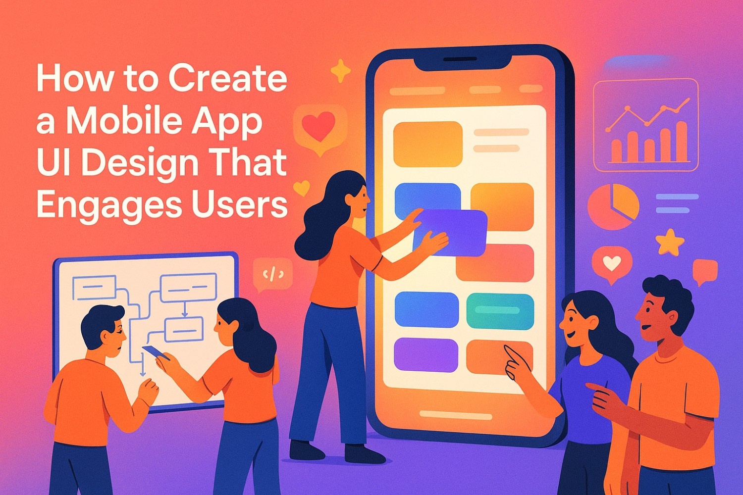
What really makes a mobile app successful and keeps users coming back? It's all about engaging UI design, not just marketing hype or a list of features.
Just think your thumb glides across the screen, every tap responds instantly, every swipe feels intentional. That's not an accident. That's expert UI design crafted with surgical precision and genuine understanding of human behavior.
In 2025, mobile design prioritizes building digital experiences that adapt to users' rhythms, whether they're rushing for a train or juggling groceries. The interface should meet their needs, not add frustration.
The secret? Design that disappears into pure function, leaving users focused entirely on what they came to accomplish. Professional UX design consulting can help transform your vision into reality, but first, let's explore what makes apps truly irresistible.
Your UI design speaks before users even read a single word. Every color choice whispers emotion. Typography reveals personality. Interactive elements either guide smoothly or create confusion across different mobile devices.
But mobile app development carries unique challenges. You're designing for thumbs, not mouse cursors. For glances stolen between meetings, not focused desktop sessions. For people walking, talking, multitasking through their messy, wonderful lives on various mobile devices.
Think of your interface as a conversation partner. Does it understand when users are hurried? Can it adapt when they're relaxed and exploring? Smart designers dig deep into user research, uncovering the difference between what people say they want and what they actually do.
Mobile app User Interface design encompasses everything users see, touch, and experience on their mobile devices. But here's what most designers miss: context is everything. Your target audience isn't sitting in perfect lighting with unlimited time and attention.
They're squinting in bright sunlight. Tapping with wet fingers. Getting interrupted by notifications, calls, kids demanding snacks. Your design needs to work beautifully in chaos, not just in your carefully controlled design environment, allowing users to accomplish goals effortlessly.
Key differences that matter:
Creating detailed user personas goes beyond demographics. Map their emotional states. When are they stressed? Excited? Distracted? These insights shape interface decisions that actually connect with real human experiences, creating user-centric solutions.
Your mobile app lives on devices ranging from compact phones to massive tablets. Users flip between portrait and landscape without thinking. They expect seamless app experience across every possible configuration.
Responsive design isn't just about flexible layouts. It's about understanding how users interact differently with various devices and screen sizes. What works perfectly on a phone might feel awkward on a tablet. Design with intention for each context, not just flexible containers.
Want to know the real difference between mobile app experiences people love and apps they tolerate? It comes down to following fundamental principles that create experiences users actually enjoy using.
Clean layouts don't happen by accident. They require ruthless design decisions and the courage to remove everything unnecessary. When designers get precious about their work, users suffer through cluttered interfaces.
Ask this question relentlessly: "Does this element help users accomplish their goal faster?" If the answer isn't a clear yes, cut it. Users appreciate interfaces that get out of their way and let them focus on what matters most.
Visual hierarchy guides attention naturally through strategic visual elements. Important components demand attention through size, color, positioning. Secondary information supports without competing. Everything else stays accessible but unobtrusive.
Users shouldn't think about how to navigate somewhere. They should just go there. Natural navigation patterns create predictable experiences that feel effortless across mobile platforms.
Essential navigation patterns:
Implement familiar patterns users already understand. Breaking conventions requires compelling design process considerations and extensive testing. Innovation for its own sake often creates confusion rather than delight.
Beautiful apps get more patience when things go wrong. Ugly apps? Users abandon ship at the first hiccup. Professional visual design creates emotional connections that transcend functional benefits and enhance user engagement.
Color psychology influences behavior more than most designers realize. Warm colors create energy and urgency. Cool colors promote calm and trust. Use contrast strategically to highlight important actions and improve readability for users with visual impairments.
Typography serves dual purposes: communication and personality. Choose fonts that remain legible in various conditions while expressing your brand character. Establish clear hierarchies with headers, subheaders, and body text that guide users through digital content naturally.
Designing for everyone isn't just good karma. It's smart business. Color-blind users, people with motor difficulties, vision-impaired individuals all deserve amazing experiences that demonstrate deep understanding of diverse needs.
Critical accessibility considerations:
These principles create apps that stand out in crowded app stores. Users notice the difference, even if they can't articulate why your mobile app feels better than alternatives.
Great mobile apps share common DNA: they put users at the absolute center of every design decision, creating experiences that feel tailored and intuitive while delivering real value.
Before adding any feature, ask: "Does this help my user accomplish their goal faster and easier?" This simple question eliminates feature bloat and keeps apps focused on delivering meaningful functionality.
Visual design elements work together like a symphony. Clean layouts provide rhythm. Balanced spacing creates breathing room. Smart color choices guide attention exactly where you need it. Every element should have purpose and contribute to the overall user satisfaction.
Whitespace isn't empty space. It's breathing room for your content. Proper spacing between elements reduces cognitive load and creates visual hierarchy. Users can scan information quickly and focus on what matters most.
Consider whitespace as an active design element, not leftover space. It directs attention, creates relationships between elements, and provides visual rest in complex interfaces where users interact frequently.
Icons shouldn't just look pretty. They should communicate meaning instantly. Universal symbols like home, search, and settings require no explanation. Custom icons need clear meaning and consistent style throughout your mobile app.
Test icon recognition with real users. What seems obvious to designers often confuses actual end users. When in doubt, add labels or use established conventions that work across different screen sizes.
Font choices convey personality and brand identity. Size, weight, and spacing affect readability and user comprehension. Establish clear typographical systems with defined roles for each text style in your style guide.
Typography hierarchy essentials:
Smooth interactions feel like magic under users' fingertips. Subtle animations provide feedback and delight. Micro-interactions confirm actions and guide users through complex processes with intuitive flow.
Button design significantly affects user behavior. Primary actions need visual prominence through size, color, or placement. Secondary actions should be available but less prominent. Destructive actions require extra confirmation to prevent accidents.
Form design can make or break user onboarding experiences. Keep forms short and focused on essential information. Use smart defaults, input validation, and progress indicators to reduce friction and abandonment rates.
Loading states and empty states deserve design attention. Users need feedback when waiting for content. Empty states provide opportunities to educate, motivate, or guide users toward productive actions that enhance overall usability.
Well-designed animations don't just look impressive. They guide users through complex processes, turning confusion into confidence by showing relationships between interface elements across various mobile devices.
The goal? Make your mobile app feel so natural that using it becomes second nature. When interfaces disappear and users focus entirely on accomplishing their goals, you've achieved design excellence.
Creating killer mobile app UI follows a proven roadmap. Skip steps, and you'll pay later with confused users and negative reviews. Following structured design process methodologies ensures better outcomes and reduces costly revisions.
What problem does your mobile app solve? Who needs this solution desperately? These answers shape every design decision that follows. Write down specific, measurable objectives for your app's success and user engagement metrics.
Define success metrics early. How will you measure user engagement, task completion, and satisfaction? Clear metrics guide design decisions and help evaluate effectiveness after launch across different mobile devices.
Study user behavior patterns through surveys, interviews, and observation. Analyze competitor strengths and weaknesses. Look for gaps you can fill brilliantly using useful tools and research methodologies.
Essential research activities:
Conduct user interviews to understand the language users use to describe their problems. How do they currently solve these challenges? What frustrates them about existing solutions? These insights inform design decisions that actually resonate and create visually appealing solutions.
How will people move through your mobile app? What's their ideal journey from opening to goal completion? Document every step, decision point, and potential obstacle that might affect the app experience.
User flows diagrams visualize the complete experience. Start with user goals and map backward to identify required features and screens. Consider alternative paths and edge cases that might confuse users across mobile platforms.
Information architecture organizes digital content logically. Group related features and content together. Create clear navigation paths between sections. Test your organizational structure with card sorting exercises using real world examples.
Simple layouts let you test ideas quickly without getting distracted by colors and fonts. Structure first, beauty second. Focus on functionality and user flows before visual details that might distract from core usability.
Low-fidelity wireframes communicate layout concepts without visual distractions. Use simple boxes, lines, and placeholder text to represent content areas and interactive elements. Test multiple layout options quickly across different screen sizes.
Build interactive prototypes that simulate real app experiences. Test early, fail cheap, iterate fast. Prototypes help stakeholders understand user experience before development begins, reducing risks during implementation.
High-fidelity prototypes include realistic content, interactions, and transitions. Test these prototypes with real users to identify usability issues and gather feedback on overall experience across various devices.
Now add your style guides, color palettes, and interactive magic. Make it consistent across all devices and mobile platforms. Create design systems that scale as your mobile app grows and evolves.
Establish brand guidelines that translate effectively to mobile interfaces. Consider how your brand colors, typography, and imagery work on small screens with various lighting conditions, ensuring aesthetic appeal remains consistent.
Prepare assets developers can actually use. Include specifications for spacing, colors, typography, and interactions. Create documentation that eliminates guesswork during implementation, allowing designers to communicate effectively with development teams.
Design systems facilitate smooth development handoffs. Document component behaviors, states, and variations. Provide code snippets and asset files in required formats that enhance the overall development process.
Following this process eliminates guesswork and reduces costly revisions. Each step builds upon previous work, creating momentum toward successful launch across mobile platforms.
Even the most beautiful apps fail without proper testing. Smart designers test everything, then test some more. Comprehensive testing identifies problems before users encounter them and provides data for continuous improvement.
Use your own mobile app religiously. Find the annoying quirks and fix them before users do. Experience every user flow personally to understand pain points and friction areas that affect user satisfaction.
Test your app in various real-world conditions. Use it while walking, in bright sunlight, with distractions around you. Different context scenarios reveal usability issues that laboratory testing might miss.
Scripts can check functionality across dozens of devices while you sleep. Set up automated tests for critical user flows like registration, login, and core features. Automated regression testing ensures new updates don't break existing functionality.
Automated testing priorities:
Your mobile app should work flawlessly on ancient Android phones and the latest iPhones. No excuses. Test across different screen sizes, operating system versions, and device capabilities to ensure consistent access.
Create a device testing matrix covering your target audience's most common devices. Include both new flagship phones and older budget devices that many users still rely on daily.
Usability testing reveals painful truths about your design. Users will try things you never imagined. Their behavior provides invaluable insights for improvement that enhance overall user engagement.
Conduct moderated usability tests to observe user behavior directly. Watch where users hesitate, make mistakes, or express frustration. Listen to their verbal feedback during task completion across different interfaces.
Remote usability testing tools allow broader participant recruitment and more natural testing environments. Users test your mobile app in their own context, providing realistic usage patterns and authentic feedback.
Slow apps lose users faster than bad coffee loses customers. Monitor speed, battery usage, and memory consumption across different devices and network conditions to maintain optimal functionality.
Performance metrics that matter:
Gather feedback constantly through in-app surveys, app store reviews, and analytics data. Track engagement metrics obsessively to understand user behavior patterns and enhance user satisfaction.
Run A/B tests on everything questionable. Test different button colors, placement, copy, and interactions. Data-driven design decisions outperform opinions and assumptions every time, allowing users better experiences.
Heat mapping tools reveal where users interact, scroll, and spend time on your screens. Use this data to optimize layouts and prioritize important elements in high-attention areas.
Theory means nothing without flawless execution. Here's how to implement designs that truly enhance user engagement and create memorable experiences across all touchpoints and mobile platforms.
Establish consistent colors, fonts, and icons before building anything. Consistency builds trust and recognition. Users learn your interface patterns and can predict behavior across different screens and devices.
Create comprehensive style guide documentation covering typography, color palettes, iconography, spacing, and component behaviors. Document when and how to use each element to maintain consistency across your entire mobile app.
Design system components:
Component libraries accelerate development and ensure consistency. Build reusable interactive elements like buttons, forms, cards, and navigation components. Each component should include multiple states and variations.
If users need instructions to understand your user interface, redesign it. Intuitive design beats education in mobile app development. Users want to accomplish goals quickly without learning new interaction patterns.
Follow established mobile design patterns that users already understand. Platform-specific guidelines from Apple and Android provide tested interaction models that users expect on their devices.
Reduce cognitive load by minimizing choices and simplifying decision-making processes. Progressive disclosure reveals complex features gradually as users need them, creating more focused experiences.
Lightweight graphics load faster. Minimal animations feel smoother. Every millisecond matters in user perception and satisfaction. Fast apps feel more responsive and professional across all mobile platforms.
Speed optimization strategies:
Buttons should be big enough for rushed taps. Important elements belong within easy reach of thumbs on larger screens. Consider how people actually hold their mobile devices during daily use.
The minimum touch target size should be 44 pixels for comfortable user interaction. Provide adequate spacing between interactive elements to prevent accidental taps that frustrate users.
Design for one-handed use when possible. Place navigation and primary actions within thumb reach zones on larger devices. Offer alternative interaction methods for complex gestures that enhance usability.
iOS users expect certain behaviors. Android users have different expectations. Respect both mobile platforms while maintaining your brand identity and visual consistency.
Study Human Interface Guidelines for iOS and Material Design principles for Android. Understand platform-specific navigation patterns, typography, and interaction behaviors that create intuitive experiences.
Adapt your design appropriately for each platform without compromising brand identity. Users should recognize your mobile app while feeling at home on their chosen platform and devices.
Users should instantly recognize your mobile app, regardless of device. Maintain visual consistency while respecting platform conventions that users expect and understand.
Create brand guidelines that translate effectively across different screen sizes and platform requirements. Your logo, colors, and key visual elements should work harmoniously with platform-specific design patterns.
Working with experienced custom software development services can ensure your design vision translates perfectly across mobile platforms while maintaining technical excellence and user satisfaction.
Design trends come and go like fashion seasons. Smart designers follow selectively, choosing trends that improve user experience rather than just following popular aesthetics across mobile platforms.
Clean lines, bold colors, and minimal decorations create fast, focused experiences that load quickly and scale beautifully across screen sizes. Flat design elements are easier to recognize and interact with on small screens.
They create visual hierarchy through color and typography rather than shadows and gradients that might not display well on all devices and mobile platforms.
Whitespace isn't empty space. It's intentional breathing room that helps users focus on important content. Every element earns its place through purpose and functionality that enhances the overall app experience.
Modern minimalism includes subtle personality through thoughtful typography choices, strategic color use, and meaningful micro-interactions that delight without overwhelming users or compromising usability.
Swipes and taps should feel like natural extensions of thought processes. Users learn gesture patterns quickly when they're intuitive and consistent across different mobile devices and interfaces.
Popular gesture patterns:
However, always provide visual cues for gesture interactions. Hidden gestures confuse new users and create accessibility barriers for people with different abilities.
Face ID, fingerprints, and phone verification make authentication invisible and instant. Users complete login processes without typing complex passwords, improving both user engagement and security.
Biometric authentication reduces abandonment during sign-up processes. Social login options provide alternatives for users who prefer them while maintaining security standards across mobile platforms.
Sometimes talking beats tapping, especially for complex searches, navigation, or when users' hands are busy with other activities. Voice functionality adds valuable accessibility options.
Implement voice features thoughtfully, providing clear triggers and feedback. Not all users want voice interaction, so maintain traditional input methods as alternatives that enhance overall usability.
Reduced eye strain and battery savings make users genuinely happier, especially during extended mobile app usage sessions. OLED screens benefit significantly from dark interfaces that enhance visual appeal.
Design dark mode as a complete theme, not just an inverted color scheme. Adjust contrast ratios, use appropriate accent colors, and test readability in various lighting conditions across mobile devices.
Subtle animations feel more natural than abrupt state changes. Use motion purposefully to communicate relationships between interface elements, provide feedback for user actions, and guide attention to important changes.
Effective motion design practices:
Important controls belong within thumb reach on larger devices. Ergonomics matter more than traditional aesthetics when users interact with apps throughout the day on various mobile devices.
Consider thumb zones and reachability when placing interactive elements. Primary actions should be easily accessible without hand repositioning, creating more intuitive user experiences.
Frosted glass effects and subtle transparency create visual interest when used thoughtfully. Be cautious with transparency effects that might reduce text readability or create confusion about interactive elements.
Test these effects on various backgrounds and content types to ensure they enhance rather than hinder usability across different mobile platforms and screen sizes.
The best trend is solving user problems effectively and creating delightful interactions that support user goals. Follow trends that enhance functionality and user engagement, not just visual appeal.
Building from scratch isn't always smart or efficient. Quality templates and resources accelerate development timelines while ensuring design consistency and reducing costs across mobile platforms.
Premium platforms provide tested, polished solutions refined through multiple projects and user feedback. Investment upfront saves headaches later and often results in higher-quality outcomes.
Free resource libraries offer solid starting points for teams with limited budgets. Many free resources provide excellent foundations that can be customized to match specific brand requirements and enhance user engagement.
Resource comparison by type:
One excellent template that matches your needs beats fifty mediocre options requiring extensive customization. Evaluate templates based on code quality, design system completeness, documentation quality, and ongoing support.
Well-documented templates save development time and reduce implementation errors. Consider licensing requirements when using templates and resources. Understanding licensing prevents legal issues later in the development process.
Generic templates should serve as starting points, not final solutions. Add your unique value proposition through customization and enhancement that reflects your brand personality and serves your target audience effectively.
Professional brand design consultation can help transform template foundations into distinctive user experiences that truly represent your vision across mobile platforms.
Creating engaging mobile app UI requires expertise, experience, and relentless attention to detail that comes from working across multiple projects and industries with diverse user needs.
Professional UX design teams bring tested methodologies and insights from diverse project experiences. They've seen what works across different industries, user types, and platform requirements on various mobile devices.
Expert designers understand user psychology, platform nuances, and emerging technologies. They balance creativity with functionality, beauty with usability, and innovation with familiarity to create superior user experiences.
Experienced design teams have established workflows that reduce project timelines and minimize revisions. They know which design decisions require testing and which follow established best practices across mobile platforms.
Professional designers bring specialized useful tools, resources, and techniques that internal teams might not have access to or experience with. They stay current with design trends and platform updates.
The right design partner doesn't just create pretty interfaces. They solve business problems through thoughtful design decisions that affect user behavior, conversion rates, and long-term user engagement across mobile platforms.
Collaborative design process methodologies include stakeholder input while maintaining design integrity. Professional teams know how to incorporate feedback constructively without compromising user experience goals.
Post-launch support and optimization services help apps evolve based on real user behavior and changing market conditions. Design isn't a one-time project; it's an ongoing process of improvement and enhancement.
Teams that specialize in startup UI/UX design understand the unique challenges of launching new products and can provide guidance throughout the entire product lifecycle.
Mobile app UI design in 2025 demands more than visual flair and trendy aesthetics. It requires deep understanding of user needs, systematic design process execution, and continuous optimization based on real usage data from mobile devices.
Begin with your users' needs, goals, and contexts. Build clear, simple interfaces that feel natural on every device and platform. Test relentlessly with real users in realistic conditions. Iterate constantly based on feedback and performance data.
Remember: great design isn't just about how it looks. It's about how it works and how it makes people feel during every user interaction. Emotional connections drive long-term user engagement and loyalty.
Solve actual problems rather than showcasing design skills. Users care about accomplishing their goals quickly and easily. Everything else is secondary to functional excellence and intuitive usability that creates real value.
Invest in proper user research, testing, and iteration cycles. Rushing to market with untested designs often results in higher costs and user dissatisfaction than taking time to validate design decisions properly.
Whether you're exploring MVP development or scaling an existing product, the right design partner can accelerate your timeline while ensuring exceptional user experiences across mobile platforms.
Professional design services provide expertise, resources, and proven processes that transform good ideas into exceptional user experiences that drive business results and enhance customer satisfaction.
Ready to create mobile app UI that truly engages users? The tools, techniques, and trends are available. The only question is: will you use them strategically to create meaningful user experiences that keep people coming back to your mobile app?
Great UI design transforms complex tasks into simple, enjoyable experiences that users actually want to repeat. When interfaces feel intuitive and look visually appealing, users stay engaged longer, complete more tasks, and recommend apps to others. Poor design creates friction that drives users away, often permanently.
Studies show users form opinions about mobile apps within 50 milliseconds of first interaction. Professional UI design ensures those crucial first impressions lead to positive outcomes and long-term user engagement across mobile platforms.
Focus on trends that improve functionality over pure aesthetic appeal. Flat design, voice interfaces, gesture navigation, and dark mode all enhance usability while looking modern. However, always test trends with your specific target audience before full implementation.
The most important trend isn't visual: it's designing with empathy for real user contexts and constraints. Prioritize accessibility, performance, and intuitive interactions over flashy effects that don't enhance core functionality.
Start with comprehensive user research to understand goals, frustrations, and preferences. Let user needs guide every design decision rather than personal preferences or industry assumptions. Consider your users' technical skill level, device preferences, and usage contexts.
Analyze successful apps in your category and adjacent markets to identify proven patterns. Then innovate strategically in areas where you can provide unique real value without confusing established user expectations across mobile devices.
Initially, yes, professional design requires upfront investment. However, smart design reduces development time, prevents costly revisions, and increases user retention, delivering better long-term ROI.
Poor design often costs more through user acquisition challenges, negative reviews, and constant fixes. Quality design creates sustainable competitive advantages that pay dividends over time and enhance overall user satisfaction.
For unique, complex mobile apps targeting specific user needs, professional designers provide custom solutions that differentiate your product in competitive markets. Templates work well for simpler projects or tight budgets when customized thoughtfully.
Consider hybrid approaches: start with quality templates and enhance them with professional consultation for critical user flows and brand differentiation. The key is matching your approach to your specific goals, timeline, and available resources for creating exceptional user experiences.


.svg)


.svg)