
Here's something wild: 93% of consumers make choices based purely on looks. Visual appeal drives decisions. Color psychology shapes how people see your site plus how they interact with it.
Your website color scheme matters more than you think. Colors can evoke powerful emotions. They turn your site into a communication powerhouse. Get your color palette right? Visitors stick around. Get it wrong? They bounce.
Colors do more than look pretty. They talk. A smart brand color scheme builds instant trust. It triggers specific emotions. It makes you memorable. Good digital branding means understanding how color works on people. Muted shades whisper sophistication. Bold primary colors scream energy. Every choice counts.
This guide shows you how to pick the perfect colors for your brand. We will explore color theory. We will dive into practical strategies. You will learn about hex color codes plus see real color scheme examples.
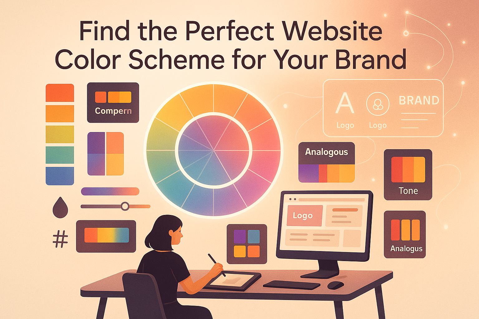
Think of your website color scheme as your visual DNA. It is your carefully picked mix of colors that defines your brand across every digital touchpoint. It follows color theory rules to create harmony. Every pixel has purpose.
Your color palette needs four key players working together:
Base Colors- These are your primary go-to colors. They show up most often on your site. They form your foundation. They typically take up 60% of your design space.
Accent Colors Bright or contrasting shades that grab attention. They highlight buttons, links, and calls-to-action. They create visual interest. They guide eyes where you want them.
Neutral Colors- Your gray, white, and black teammates. They provide breathing space. They prevent visual chaos. These colors keep your content readable.
Background Colors- The colors behind your content. They support readability. They create depth. They set the mood. They make everything else pop.
Pro designers use smart resources to craft the perfect palette:
A good scheme works everywhere. Your website. Social media. Email campaigns. All your digital spaces.
Your website's color palette is not decoration. It is a business tool. It shapes user behavior. It impacts your bottom line.
0.05 seconds. That is all it takes. Visitors form opinions about your site in a blink. Your colors hit them first. Before they read a word. Before they see your logo. This snap judgment determines if they stay or bail.
Color psychology in web design reveals emotional triggers. Different colors spark different feelings:
Colors become shorthand for brands. Think Tiffany's iconic blue. Or Coca-Cola's signature red. Use your brand color scheme consistently across platforms. You will:
The proof? Color boosts brand recognition by up to 80%.
Color hits your wallet. The right call-to-action button color can bump conversions by over 20%. Changing a "Buy Now" button from blue to orange? That small tweak might flip a bounce into a sale.
Your color choices influence:
Colors pack power. They evoke emotions fast. They shape opinions instantly. Web designers use the psychological color wheel to create experiences that click with people.
Website color psychology uncovers emotional triggers:
Red: Sparks excitement plus urgency. Drives passion. Perfect for sales or bold calls-to-action. It makes things happen now.
Blue: Screams trust plus stability. Professional vibes. Finance sites love it. Healthcare websites lean on it. Users feel safe.
Green: Whispers growth plus harmony. Environmental consciousness. Wellness brands flock here. It brings feelings of balance.
Yellow: Radiates optimism. Pure energy. Creates warmth. Captures attention without aggression.
Purple: Says creativity plus luxury. Sophistication. Shows up in luxury brand color schemes. Signals premium quality.
Orange: Brings fun plus confidence. Innovation too. Great for creative spaces. Approachable yet energetic.
Black: Commands power. Pure elegance. Authority personified. Essential in luxurious color palettes. Creates drama plus sophistication.
White: Suggests innocence plus purity. Simplicity wins. Creates space. Lets other colors breathe. Clean. Modern.
Gray: Offers neutrality. Professional middle ground. Bridges other colors perfectly. Adds sophistication without noise.
These emotional links help you create the right mood. Align it with your brand's personality.
"Colors speak a universal language with unique regional dialects." - Design Psychology Research Institute
Cultural differences matter. A lot. What color represents good luck in one place might mean mourning elsewhere. White means purity in Western cultures. In some Asian cultures? Mourning. Red signals luck in China. Danger in other places. Purple suggests royalty in many Western countries. Some South American cultures link it to mourning.
Good web design respects these global meanings. Especially if your audience spans regions.
Smart color choices establish brand credibility. They guide attention. They enhance user experience. They reinforce brand messages. They influence buying behavior. They create lasting brand memories.
Strategic color decisions drive user behavior invisibly. They separate average websites from ones that truly stimulate engagement.
Creating a good color palette takes key steps: understanding emotional impact, ensuring brand alignment, achieving technical harmony, and maintaining consistency across all digital platforms.
Extracting colors from images is a great way to start. Designers use tools to extract color from image assets like photographs, logos, or inspiration, creating schemes that truly represent the brand's look. A color palette of image elements ensures authentic representation.
Good website colors help users see what's important through clear visual signals, create visual hierarchy, make the site easier to navigate, help people remember the brand, create cohesive experiences, and support accessibility.
Learning about color psychology for websites starts with basic color principles. These principles are key to digital branding design.
Primary Colors: Red, blue, yellow are the basic colors that can't be created by mixing other colors.
Secondary Colors: Green, orange, purple are made by mixing primary colors in equal parts.
Tertiary Colors: Mixes of primary and secondary colors that create subtle variations and depth, including red-orange, yellow-green, and blue-violet.
"Color harmony creates visual order and balance that pleases the human eye." - Design Expert
Color harmony happens when colors work together to create a pleasing visual experience:
Complementary: Colors opposite each other on the color wheel. These create high contrast and energy.
Analogous: Colors next to each other on the wheel. These create serene, comfortable designs.
Triadic: Three colors equally spaced on the wheel. These offer vibrant yet balanced palettes.
Monochromatic: Variations of a single color using different shades, tints, and tones. These convey sophistication and unity.
Split-Complementary: One base color plus two colors adjacent to its complement. Offers contrast without tension.
What is saturation in psychology? Saturation affects intensity and emotional impact. Brighter colors are more energetic and demand attention, while softer, muted shades are more refined and subtle.
Good color schemes guide the eye and create engaging visuals. Color can indicate clickable elements, show current location in navigation, highlight new or important information, and separate different content sections.
Choosing the right color scheme can make a website stand out. Let's explore top website color strategies with color scheme examples:
Uses variations of a single color with different shades and tints. Creates clean, sophisticated designs perfect for professional and tech websites. Benefits include simple elegance, easy implementation, sleek modern feel, and ideal positioning for refined appearance. These minimalist color palettes work exceptionally well for minimal color palette approaches.
Combines opposite colors on the color wheel. Generates high visual contrast and energy. Best for brands wanting bold presence, highlighting important calls-to-action, and appealing to sports, entertainment, and youth-focused audiences.
Incorporates neutral tones with metallic accents like gold, silver, or rose gold. Emphasizes elegance and sophistication. These luxury color palettes often feature deep jewel tones, muted sophisticated backgrounds, strategic use of bright accent colors, and careful balance of light and dark elements. The most luxurious colors and best colors for luxury brands include colors associated with luxury like black, gold, and deep purple. These luxurious colours create luxury website color schemes and luxury brands color palette strategies.
Uses colors that sit next to each other on the color wheel. Creates harmonious, comfortable designs. Perfect for brands in health, wellness, and nature-related industries.
Uses three colors equally spaced on the color wheel. Offers vibrant combinations while maintaining balance. Great for playful, creative brands.
Strategic use of pop colors adds excitement to otherwise neutral palettes. A single bright accent color or pop of colors can energize an entire design without overwhelming users.
Choosing the right colors for your brand is a way to communicate your brand's personality and connect with your audience emotionally. Whether you're a startup looking for UI/UX design or an established brand refreshing your identity, color selection is crucial. Understanding what color represents opportunity, what color represents manipulation, or what color represents discipline helps make intentional choices.
Blue: Trustworthy and professional. Perfect for finance, healthcare, and technology.
Red: Energetic and passionate. Ideal for food, sports, and entertainment.
Green: Natural and balanced. Best for wellness, environmental, and organic brands.
Purple: Creative and luxurious. Great for beauty, luxury, and creative services.
Orange: Friendly and adventurous. Works well for fun, youthful brands.
Yellow: Optimistic and cheerful. Good for lifestyle and family-oriented brands.
Black: Powerful and elegant. Essential for luxury brands and high-end services.
Design a color scheme that grabs attention and sticks in memory. Create a unique color mix that people remember instantly, like Tiffany's blue or Coca-Cola's red.
To build strong associations: be consistent, be distinctive, be intentional, be memorable, and be flexible. Your colors become part of your brand's DNA, instantly recognizable to your audience.
Many digital tools make creating the perfect website color scheme easier. A color palette generator is essential for designers exploring new combinations.
Adobe Color CC: Advanced features for creating custom palettes and extracting colors from images. This powerful color palette generator helps designers create amazing combinations.
Coolors: Free tool that creates color combinations instantly. Just hit the spacebar to generate new palettes. One of the most helpful color palette tester free options available.
Colormind: Uses AI to make harmonious color schemes based on thousands of successful designs.
Paletton: Shows detailed color relationships and lets you see your palette applied to sample designs. Great color combo tester for verification.
Color Hunt: A curated collection of beautiful, trendy palettes created by designers worldwide. Explore inspired color scheme examples for your projects.
Canva Color Palette Generator: Upload an image and instantly extract color schemes. Perfect for creating a user interface color palette or my colors palette from existing visuals.
When picking a color palette tester, look for easy-to-use interface, accessibility compliance checks, exporting capabilities including hex color codes, cross-platform compatibility, color extraction from images, harmony verification options, website mockup previews, palette saving features, and collaboration tools. The color palette checker should help you test color palette effectiveness.
Free Options: Tools like Coolors, Color Hunt, and Paletton offer excellent features, perfect for small projects or personal sites. These free color palette test tools provide robust functionality.
Paid Options: Adobe Color CC and professional color management software offer advanced features worth the investment for professional designers. Use the color palette tester features to refine your choices.
Creating a great website color scheme needs careful planning and execution beyond aesthetics. Whether you're working on mobile app UI design or web platforms, these principles apply universally. Understanding ui design principles helps create effective color palettes.
Good color distribution follows the classic 60-30-10 rule:
60% Dominant Color: Usually a neutral or background color covering most space.
30% Secondary Color: Often your brand's primary color, providing contrast and interest.
10% Accent Color: Highlights key elements and calls-to-action.
Additional tips: use primary colors for key elements, apply accent colors to highlight important information, maintain balanced ratios, create visual flow, let lighter shades create breathing space, reserve brightest colors for most important actions, and use neutral colors to separate different content sections.
"Great design is about making complex things simple and accessible to all users." - Design Philosophy
WCAG Contrast Standards:
Accessibility Best Practices: Never rely on color alone to convey information. Ensure sufficient contrast between text and backgrounds. Test with color blindness simulators. Use patterns or icons alongside color indicators. Provide alternative visual cues beyond color coding. A proper color pattern test ensures usability.
Mobile Color Guidelines: Simplify color palettes for smaller screens. Ensure sufficient color contrast for outdoor viewing. Use responsive color techniques. Consider how colors look in bright sunlight. Optimize for both light and dark mode. Keep touch targets clearly visible. Test color palette on website across actual devices.
For comprehensive guidance on mobile app UX design, consider how color choices impact user interactions across different screen sizes and contexts.
Common mistakes include:
Stick to 2-3 main colors plus neutrals. Make sure colors are easy to see by testing contrast ratios. Get feedback from real users. Consider your audience's cultural views. Use color pattern test tools to check harmony. Start simple and add colors only when necessary. A color combination tester helps verify effectiveness.
Working with a dedicated UI/UX development team can help you avoid these common pitfalls and create a polished, professional color scheme.
Choosing colors is a journey of constant improvement. Use a color palette tester to verify effectiveness.
A/B testing reveals how colors work in real-world scenarios. Compare user engagement metrics, analyze conversion rates, measure emotional responses, identify which colors drive action, and test different palettes for various audience segments.
Feedback Methods:
The Optimization Process: Establish baseline, form hypothesis, create variations, test, analyze, implement, and iterate. Optimization is ongoing as markets change and preferences shift. Use psychological color theory and psychology color theory principles to guide decisions.
If you're developing an MVP, testing your color palette early with real users can save time and resources while ensuring your product resonates with your target audience.
Current trends include:
Current Best Practices: Incorporate subtle color transitions. Use high-contrast accent colors strategically. Experiment with innovative color gradients. Balance bold choices with neutral space. Consider how colors adapt across platforms. Test with actual users before committing. Understanding color psychology color wheel and psychology of color wheel principles helps make informed decisions.
Modern luxury color schemes and luxury colour schemes aim to tell stories that engage and inspire while maintaining elegance. Remember, great color schemes balance current aesthetics with timeless principles. The psychology of color in web design and color psychology design fundamentals remain essential.
For brands looking to create sophisticated visual identities that incorporate 3D design elements, color selection becomes even more critical as it affects depth perception and visual hierarchy. A color palette for luxury brand projects requires special attention to detail.
Choosing the right color palette sends a message that resonates with your audience. Your website's colors evoke emotion, drawing people in and keeping them engaged. Your colors should match your brand's personality and work harmoniously together.
Use the principles, tools, and strategies we've covered. Ground your choices in color psychology and color theory. Prioritize accessibility alongside aesthetics. Test thoroughly before committing using a color palette checker. Stay consistent across platforms. Let data guide decisions. Balance trends with timeless appeal.
Whether you need professional UI design services, custom software development, or team augmentation to bring your vision to life, Intuitia can help you create a perfect website color scheme that truly represents your brand and connects with your audience. Learn from color scheme examples and use color palette generators to explore possibilities.
Why are color schemes so important for website design?
Color schemes affect how users feel and perceive your brand. The right colors showcase personality, engage users, and make your site stand out while building trust and guiding behavior.
How do I choose the right color palette for my brand?
Understand your brand's personality and target audience. Consider desired emotions and industry standards. Use color wheels and generators to find fitting colors while testing combinations before finalizing.
What are the most important color psychology principles for web design?
Colors evoke specific emotions. Blue is trustworthy, red is exciting, green is calm, purple is luxurious. Always consider your brand's message and audience when selecting colors.
How many colors should I use in my website color scheme?
Use 3-5 colors including one main color, 1-2 secondary colors, and 1-2 accent colors. The 60-30-10 rule creates balance without overwhelming visitors.
Can I change my website's color scheme after launch?
Yes, but do it carefully. Small tweaks are fine, but big changes can upset users. Make changes gradually and use A/B testing to measure impact first.
What are the best free tools for creating color palettes?
Great free tools include Adobe Color, Coolors, Color Hunt, and Canva's Color Palette Generator. They help find and test colors and extract colors from images effectively.
How do I ensure my color scheme is accessible?
Ensure clear, readable colors. Use WebAIM's Contrast Checker for text against backgrounds. Follow WCAG guidelines for proper contrast. Test with color blindness simulators before finalizing.


.svg)


.svg)