

Most people land on a web portal and feel one of two things: either everything is right where they need it, or they are completely lost. There is rarely an in-between.
That gap comes down to design. Not just how a portal looks, but how it works. How it guides users. How quickly it gets them from point A to point B without making them think twice.
This guide covers everything you need to know about website portal design, from the core principles to real mistakes to avoid.
Whether you are building a customer portal, an employee intranet, or a membership hub, you will walk away with a clear picture of how to do it right. And if you want to see how good portal design feels in practice, take a look at Intuitia's portfolio for some solid real-world examples.
A web portal is a private, gated space online where specific users log in to access information and tools built just for them. Think of it as the difference between a public library and a private members club. Anyone can walk into the library. But the club? You need to belong.
A regular website shows the same content to everyone. A portal shows each user exactly what is relevant to them based on who they are and what role they hold.
Website portal design is the process of planning and building that experience. It covers layout, navigation, dashboard structure, user access, and everything in between. Done well, it saves your users time and reduces the number of support requests your team has to handle.
Not all portals are the same. The design priorities shift depending on who uses it and what they need to do. Here is a quick breakdown.
These let customers manage their accounts, raise support tickets, track orders, or access invoices on their own. The design priority here is speed and clarity. Users want answers fast. Keep the interface clean and make common actions one click away.
Internal portals serve your team. Think HR tools, company announcements, expense tracking, and project updates. The design focus shifts to role-based access, meaning each department sees only what applies to them.
These are B2B portals where suppliers, partners, or resellers log in to share data, submit documents, or check order status. Design needs to feel professional and make data easy to scan.
Membership platforms, online courses, and community forums all fall here. Users expect a rich, engaging experience. If you are working on something like this, our guide on mobile app UX design covers interaction patterns that translate well to member-facing portals.
These give customers a personalized dashboard with order history, wishlists, loyalty points, and product recommendations. The design should feel personal. Every element should be tied to that specific user's activity.
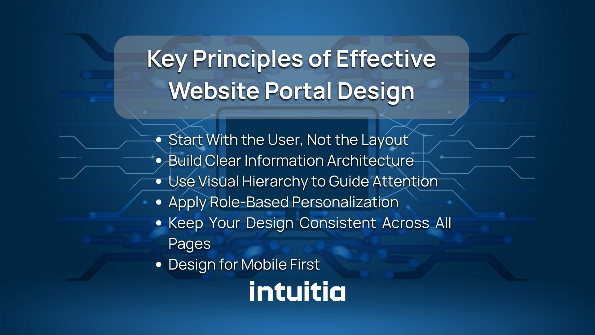
Good portal design is not about making things look nice. It is about making things work. Here are the principles that actually matter.
Before you open a design tool, you need to understand who will use your portal and what they are trying to accomplish. Building personas helps you make smarter decisions about what to show and what to hide. Our article on how to create a persona walks through this process step by step.
Information architecture is how you organize and label everything inside the portal. Bad labeling causes users to click around aimlessly. Good labeling means users find things on their first try. Group related features together. Use plain, familiar words for menu items.
Not everything deserves equal attention on a screen. Visual hierarchy uses size, contrast, spacing, and color to tell users where to look first. If your portal looks flat and crowded, users will not know where to start. Understanding UX design principles helps you apply this naturally throughout the interface.
A customer should never see an admin panel. An intern should not have access to payroll data. Role-based design means each user only sees what they need. It reduces clutter, improves security, and makes the portal feel built for that specific person.
Consistency builds trust. When buttons look different on page 3 than on page 1, users feel something is off. Set a design system early and stick to it. Same fonts, same spacing, same button styles throughout.
A lot of portal users access their accounts on a phone. Especially customer-facing portals. If your portal breaks on mobile, you are losing users. Start with the smallest screen and scale up, not the other way around.
Here is the honest truth: a portal without the right features is just a locked website. These are the elements that make a portal actually useful.
If you are building a portal as part of a larger product, it is worth reading about UI/UX development best practices to make sure your feature set aligns with solid technical foundations.
The dashboard is the first screen users see after logging in. It sets the tone for everything. Get this right and users feel confident. Get it wrong and they start clicking around, confused.
Most portal dashboards fail because they try to show everything at once. The result is a wall of data that tells the user nothing useful.
Here is what actually works:
If you want to see how this plays out in a real product, take a look at how our UI design service approaches dashboard structure and visual layout.
Navigation is where most portals fall apart. Users should never have to guess where something is. Here is how to design navigation that actually works.
Sidebars work best for portals with many sections. They stay visible while users scroll, which reduces the mental effort of remembering where things are. Top navigation works better for simpler portals with fewer than six main sections.
If your portal has multiple levels, users need breadcrumbs to know where they are. Something as simple as "Dashboard > Projects > Q2 Report" tells users exactly how to retrace their steps.
For complex portals with a lot of content, search becomes the primary way users find things. Make it prominent. Put it at the top of the page. And make sure results are relevant and fast.
On mobile, a sidebar does not work well. Use a bottom tab bar for the most common sections, and a hamburger menu for secondary items. Keep the tab bar to five items or fewer.
Design does not stand still. These are the shifts happening right now in portal design. If you want to go deeper on what is coming next, our piece on the future of UX design covers the bigger picture well.
Portals are starting to learn from user behavior. If a sales rep always checks the pipeline report first thing in the morning, a smart dashboard will surface that automatically. This reduces friction without the user having to configure anything.
Small animations, hover effects, and real-time form validation make portals feel alive and responsive. When a user clicks a button and nothing happens, they panic. Micro-interactions confirm that the system is working.
Fewer elements on screen means faster decisions. Modern portal design strips out anything that does not directly serve the user. White space is not empty. It is breathing room that helps users focus.
More users expect dark mode as a default option. For portals used for long stretches, like internal tools or monitoring dashboards, dark mode reduces eye strain significantly.
WCAG 2.2 compliance is no longer optional for serious products. Accessible design means keyboard navigation, sufficient color contrast, screen reader compatibility, and clear focus states. It also improves the experience for all users, not just those with disabilities. Our article on website color schemes touches on how color choices affect both accessibility and brand perception.
These are the mistakes that show up most often. Some are obvious in hindsight. Others creep in during development and only become visible once real users try the portal.
If you are rethinking an existing portal, our guide on how to redesign a website gives a structured approach that applies equally well to portals.
Here is a clear path from zero to a working portal. Skip any of these steps and you will likely have to come back and redo work later.
If you are working through this process for a product from scratch, our MVP development guide for startups is a useful companion. It helps you prioritise what to build first without overcomplicating the scope.
The right tool depends on your team's skills, your budget, and how custom the portal needs to be. Here is an honest breakdown.
If you are leaning toward custom development but want to explore whether a no-code option could save time, take a look at our comparison of the best no-code website builders to see where each approach makes sense.
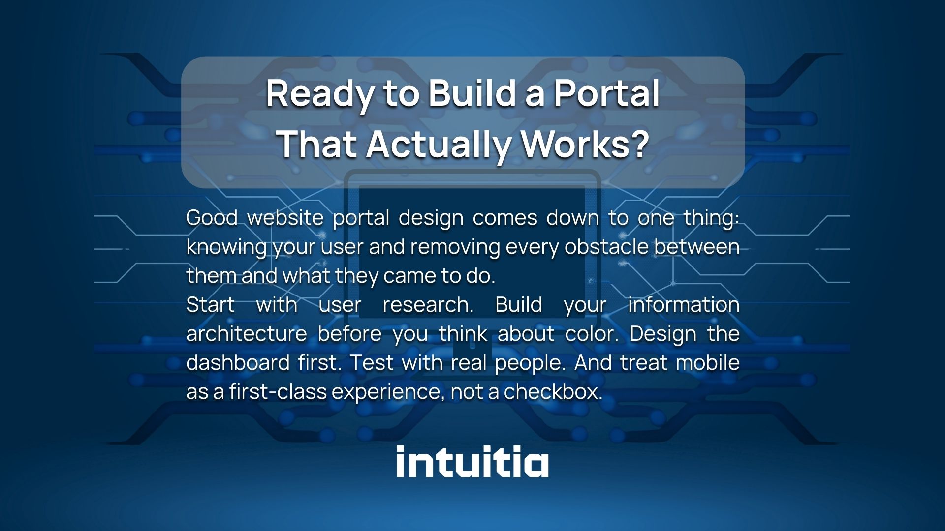
Good website portal design comes down to one thing: knowing your user and removing every obstacle between them and what they came to do.
Start with user research. Build your information architecture before you think about color. Design the dashboard first. Test with real people. And treat mobile as a first-class experience, not a checkbox.
If you want to work with a team that has done this before, get in touch with Intuitia. We help startups and growing businesses design portals that users actually want to use. And if you are still exploring what kind of support you need, our UX design consulting service is a good place to start.
What is the difference between a website and a web portal?
A website is public and shows the same content to every visitor. A web portal is private, requires a login, and shows personalised content based on who the user is and what role they hold.
What makes a good web portal design?
Good portal design is fast to navigate, consistent in its visuals, and built around specific user goals. It uses role-based access so each user only sees what is relevant to them. And it works just as well on a phone as it does on a desktop.
How much does it cost to design a web portal?
Costs vary widely. A no-code portal using tools like Knack or Glide can be built for a few hundred dollars per month. A custom-built portal with complex integrations can range from $10,000 to well over $100,000 depending on scope and the team behind it.
How do I make my web portal mobile-friendly?
Start the design process on a small screen before scaling to desktop. Use responsive layouts, bottom tab navigation on mobile, and test every key screen on an actual phone before launch.
What are the most important features of a web portal?
Secure login, a personalised dashboard, smart search, role-based access, and clear navigation. Everything else builds on top of those five.


.svg)


.svg)